Microsoft SharePoint is a platform, designed by Microsoft in 2001. The software’s main purpose is to provide all the company’s employees with different tools for effective convenient collaboration.
Meaning and history
Microsoft SharePoint Products and Technologies is an enterprise-focused set of software products and components for working with corporate information through websites.
Microsoft SharePoint is the fastest-growing software product (as measured by the revenue it generates) in Microsoft history. The main purpose of the SharePoint web-based platform is to quickly create internal pages and websites. The main tasks that such a site solves are publishing news, announcements, calendars, sharing files, and discussing the events and materials published. In addition to the usual web pages with comments and files, you can create forums blogs, and tasks.
Microsoft SharePoint allows you to flexibly configure access rights to sites and files to ensure security. The platform is compatible with any Internet browser.
SharePoint platform includes a set of web-based collaboration applications, a set of functions for creating blogs and web portals, a search engine for filtering and searching data, a module for creating forms for entering information, and various features for workflow management and business intelligence.
What is Microsoft SharePoint?
Microsoft SharePoint is not a simple software, but a collection of programs designed to solve a set of problems: to create a comfortable environment in which employees could productively interact with each other, store, organize and find information, and manage work processes.
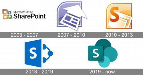
As for the visual identity, the Microsoft SharePoint logo has changed dramatically the tough out the years, with several complete redesigns, following the refinement of the Microsoft corporate style.
2003 – 2007
The very first version of the logo, used by the SharePoint platform, stayed with it for more than four years. It was a simple yet bright badge, with the corporate colorful emblem of the Microsoft company set on the left from the two-leveled inscription in bold clean sans-serif. The black inscription added a touch of seriousness and professionalism to the banner.
2007 – 2010
The redesign of 2007 has introduced a Microsoft SharePoint icon with no lettering on it. It was a graphical badge in a purple and white color palette, with a massive three-dimensional arrow, pointing upright, and having its handle stylized as a spreadsheet. The arrow was placed over a gradient light-purple banner with the top left corner rounded.
2010 – 2013
In 2010 the square shape with one corner rounded was kept for the SharePoint badge, but the concept and the color palette were completely changed. The new logo was set in a yellow, orange, and white color palette, while the arrow was removed, and a bright dark capital “S” was now written across the left part of the badge.
2013 – 2019
The redesign of 2013 has introduced a completely different version of the Microsoft SharePoint logo, which was now drawn in solid blue with white accents, without any gradients or heavy details. It was a logo, which looked like a slightly opened book, with the solid cover decorated by a white capital “S”, and a contoured circular shape inside.
2019 – Today
The concept of the Microsoft SharePoint logo was changed again in 2019, after the complete redesign of the whistle Microsoft visual identity. The new badge is executed in a dark and deep sea-blue palette, with some green hues in all four elements of the logo. The new badge is formed by three solid circles with a softened square overlapping them on the left. The thin white capital “S” is written over the square with rounded angles.
Font and color
The logo of Microsoft SharePoint has just one character in it, and it is a bold clean sans-serif letter “S”, which is executed in a modern and pretty simple font with now unique features.
As for the color palette of the Microsoft SharePoint visual identity, it is composed of several shades of sea-blue or dark turquoise, color of creativity, imagination, and protection. The badge looks very sleek and modern, while the white letter “S” adds a touch of professionalism and confidence to the composition.


