Micromax is an Indian consumer electronics brand, one of the largest in India and 10th largest mobile phone player in the world. Micromax was incorporated in 2000 by Rahul Sharma and Rajesh Agarwal and began selling mobiles in 2008.
Meaning and history
Micromax Informatics Limited is one of the leading companies in India, which, in addition to the production of home appliances, is actively introducing advanced technologies in the manufacture of smartphones. The company is now the world’s 10th-largest manufacturer of communication devices and the second-largest manufacturer of smartphones in India.
Micromax started its activities on March 29, 2000, but the first products were not mobile products, but home appliances. The association was registered as Micromax Informatics. In 2008, the organization began its activities in the mobile business.
It was one of the first companies in India, which was not afraid to challenge the advanced technology of Nokia, which at the time held more than 70% of the Indian market. Two years later, Micromax was ranked 4th among the leading sellers of cell phones. By that time there were already about 40 smartphone models on the market.
What is Micromax?
Micromax is the name of the largest manufacturer of smartphones in India, which was established in 2000. The company also produces other gadgets, such as laptops and tablets, along with consumer electronic items, including air conditioners, washing machines, and refrigerators.
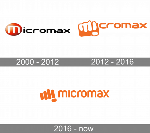
2000 – 2012
The 2000 design has ‘Micromax’ written in squat, wide letters. Besides the capital ‘M’, every other letter is black here. The former, for its part, is white and put inside an orange circle with some shading and lighting effects.
2012 – 2016
This evolution used the same writing font, except the letters grew a bit bolder. Moreover, much of the logo became orange, save for just a bit of white for ‘M’ and ‘I’. These, for their part, were arranged into a sort of clenched fist, where these letters represented knuckles and fingers. The rest of the ‘fist’ was orange, as well.
2016 – Today
The Micromax logo is a perfect reflection of the company’s dynamic and young character.
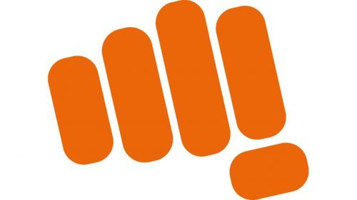
The orange punch logo is a true mirror of the brand which is innovative, bold, extrovert and fun. It is inspired by a hand, holding a mobile phone. The hand knuckles form an ‘M’ and an inverted ‘i’ of ‘Micromax.’
The color palette is as brave and fresh as the whole logo composition. The contrast of orange and white makes the logo look young and bold.
The Micromax logo was developed through an extensive crowdsourcing exercise undertaken by Micromax, in association with Talent house India, inviting participants to submit their version of the brand’s visual identity icon. Eric Atkins was the winner of the competition.
Font and Color
The stylish and bold lowercase lettering from the primary Micromax logo is set in a modern sans-serif typeface, which looks very stable and progressive. The closest fonts to the one, used in this insignia, are, probably, Uni Sans SemiBold or Somatype Heavy with some minor modifications of the lines.
As for the color palette of the Micromax visual identity, it is based on a deep medium-dark shade of orange, which looks energetic and evokes a sense of joy, motion, and energy. The contrast with the white background makes the logo look bright and memorable, representing the strong company at its best.


