Mercury is an American brand of cars, which was created by Ford in 1938. The brand was focused on the North and South American markets and the production of cars under the Mercury name was discontinued in 2010.
Meaning and history
The Mercury brand was created by Henry Ford’s son, Edsel, with the idea of medium-budget cars, which will form a golden middle between Ford and Lincoln labels.
The brand was named after the Greek God of merchants and travelers, who is mostly known for his winged sandals. Though it is also the name of the planet and liquid metal, the brand accents on the mythological meaning.
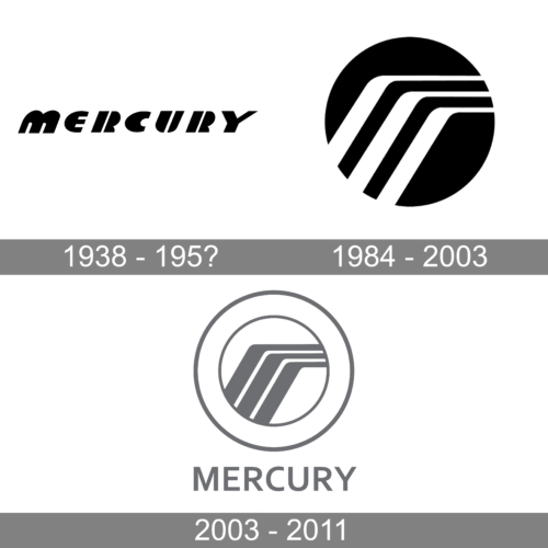
The Mercury visual identity has three main phases. The first one was a logical reflection of the brand’s name, the second was experimental and the third and last redesign brought modernity and style.
1938 – 195?
The Mercury logo from the 1940s featured a profile of the Greek God, to celebrate the brand’s name. It was a pretty detailed image, which was slightly modified throughout the years. The first version of Mercury’s visual identity stayed with the brand for almost twenty years.
In the 1950s the brand created one more emblem, which was used alongside the original one — the sharp and bold letter “M”, whose wings were spread on both sides of the car grille.
1984 – 2003
In the 1960s Mercury produces its most famous car model — Mercury Cougar, and the brand’s visual identity focus changes dramatically.
Now the cougar’s profile contour enclosed in a circle frame is the Mercury’s logo. The cougar has its mouth open and looks ready to attack. It is a representation of power and authority of the brand, with its bold and confident lines, evoking a sense of strength and influence.
The monochrome palette changed to metallic when placed on the cars. The color added elegance and luxury to the brand’s emblem, making it look timeless and stylish.
2003 – 2011
In the 2003 Mercury designs a new emblem, which is widely recognizable today. It is a tribute to the new era and modern design principles.
The last Mercury logo is composed of an abstract stylized letter “M” enclosed in a double circle frame and the nameplate around the upper part of it.
The “M” is executed in three parallel lines that go out diagonally from the inner circle frame and change their direction to the right, creating an angle.
The color palette of the latest Mercury logo resembles the second meaning of the brand’s name — the metal one. The silver-gray tone makes the Mercury visual identity look sophisticated and modern.
The Mercury emblem is known as “Winding road”, as the lines pattern looks like the road going right, it also can be seen as an abstract image of the Greek Hod’s winged helmet from the original logo version. It is an interesting and meaningful visual identity design, which fully reflects the brand’s values and history, being modern and strong.


