Meow Mix is an American brand of cat food manufacturer, which was established in 1974. Today the company also produces different supplements and cat health items, which are distributed worldwide.
Meaning and history
Meow Mix, a manufacturer of dry cat food, is a well-known Del Monte, an American-based company that produces a wide range of dry cat food. Founded in 1974, the brand is constantly coming up with new diets for the healthy lives of domestic cats. Meow Mix cat food is considered to be one of the most popular in the world.
Meow Mix dry food is mostly designed for adult indoor cats. Excellent taste, high energy value, and digestibility of the food have made the brand popular in the market for food for domestic cats.
Among the benefits of Meow Mix food are pleasant bright taste, appearance, and smell;elimination of lumps of ingested hair from the esophagus and stomach;
a wide range of offerings for the demanding tails; high-quality natural ingredients; Magnesium, which helps absorb nutrients and vitamins in the food; prevention of urinary system diseases, normalization of pH, and the Certification by the American Association of State Food Inspection.
What is Meow Mix?
Meow Mix is a brand of a line of dry, canned food and treats for cats from the American company J.M. Smucker. The brand was created in 1974 and launched with a pretty small line of products, which today has grown into a company with a huge menu of foods, suitable for different types of cats.
1974 – 1987
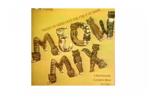
The very first logo of Meow Mix was really funny and cool. It featured a bold stylized uppercase inscription, where each letter was formed by a caricature cat figure. The logotype was executed in a brown and orange color palette and set diagonally on a dark yellow background.
1987 – 2000
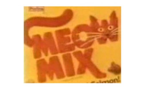
The redesign of 1987 changed the style of the inscription, drawing it in thick smooth lines of orange color on a yellow background. The letter “M” had a fancy cat’s tail coming out of it up and to the right, and the letter “W” was stylized as a cat’s face. The lines in the bottom “Mix” level of the logotype were elongated and resembles the cat’s legs. This logo stayed with the brand for more than a decade.
2000 – 2004

The concept was kept but redrawn with more volume in 2000. The car changed its direction from right to left, and the color palette got some Ted elements, which made the fur of the cat look like a tiger pattern. The face of the animal was drawn with more details and its large green eyes were the brightest element of the whole emblem now.
2004 – 2007

The colors became even brighter in 2004, and the yellow background was changed to a white one, which added more contrast to the composition and made it look strong and delightful. As for all the other elements, they remained untouched.
2007 – 2011
This version of the Meow Kid logo was to overloaded with details, so after the brand’s redesign in 2011, its visual identity was simplified yet became more elegant and classy and didn’t lose its individual character.
2011 – 2018
The redesign of 2011 introduced a modern and minimalist (in comparison to all the previous badges) Meow Mix logo, where the custom and elegant orange lettering was placed on a white background. The smooth and sleek letters of the inscription featured a thin double red and yellow outline and a light yellow shadow, which added energy and dynamics to the classy composition.
2018 – Today
The Meow Mix logo is composed of a wordmark in a custom typeface executed in a bright color palette. The nameplate is built in two levels and has both words starting with the capital “M”, one under another.
The unique hand-drawn font of the Meow Mix nameplate is smooth and elegant. The main element of the inscription is the letter “W”, which elongated tail curves upright and resembles a silhouette of a cat.
The bright orange color of the letters is accompanied by a thin white and red outline, which adds volume and dynamics to the inscription.
When placed on the package, the logo gains a darker shade of orange, in order to better stand out on the yellow background. The right side of the packaging is usually colored in a contrasting shade, depending on the type of the product.
Font and Сolor
The bold and smooth hand-written logotype from the primary badge of the Meow Mix brand is set in the title case of a soft and elegant typeface with elongated and slightly curved tails of some letters. There are no commercial analogs to the font, used in the Meow Mix logo.
As for the color palette of the popular cats’ food brand, it is set in a warm and intense dark red, which represents love, caress, and professionalism. The logo looks stable and confident, evoking a sense of trustworthiness and reliability.


