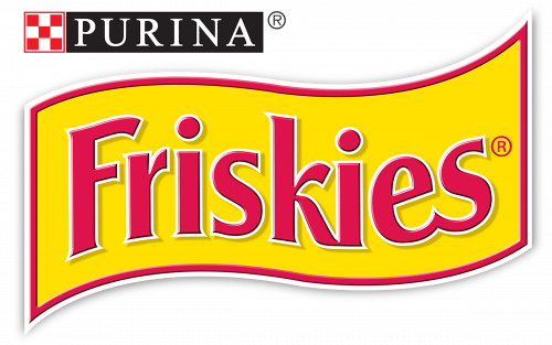
Visual consistency has been a characteristic feature of the Friskies logo throughout its almost 90-year history.
Meaning and history
The origins of the brand date back to the 1930s. It was introduced as a dry dog food brand but was reintroduced as cat food in the 1950s.
What is Friskies?
Friskies is the name of a cat-food brand; which was established in the 1930s. Interestingly, the brand was created as a dog-food label and changed its specialization only in the 1950s.
1930 – 1999
The old logo looked pretty much like the current one. You could see the yellow flag with red trim and the name of the brand in red. Even the type was somewhat similar, with the extended and diagonally cut end of the “F,” the unusual curves of the “k” and the shortened top right stroke of the “r.”
1999 – Today
The design grew a little cleaner and more elegant. The red outline of the flag has become thinner. The letters have also lost some of their thickness, due to which they look slimmer. A white outline appeared around the glyphs, which added some depth.
While the overall style of the type resembles the one on the previous Friskies logo, there are quite a few minor differences, partly caused by the modified shape of the flag. Note, for instance, the first “s,” which has been straightened.
Font and color
The elegant title case inscription from the primary Friskies logo is set in a fancy sans-serif typeface with the bars of the letters slightly flared to their ends. The closest font to the one, used for this insignia is, probably, Clear Gothic TS Semi Bold, or a Serial Bold from the same font family.
As for the color palette of the Friskies’ visual identity, it is based on the combination of red and yellow, with delicate white accents, outlining the letters of the logotype for better contrast.


