Mayo Clinic is a US-based nonprofit academic medical center combining integrated patient care, education, and research. More than 4,500 physicians and scientists work there. The company has three major campuses (in Minnesota, Florida, and Arizona).
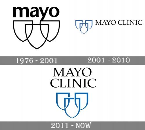
Over the last 45 years, the Mayo Clinic logo has preserved its core, the three shields.
Meaning and history
The origins of the medical center can be traced back to 1864 when William Worrall Mayo and his family settled down in Rochester. It was then that Mayo began a sole proprietorship medical practice. Over time, his two sons also started a medical practice. Soon, they founded Mayo Clinic in collaboration with six practice partners.
1976
The design combines three shields with the short name of the clinic above.
According to the explanation found on the official website, the shields symbolizes clinical practice, education, and research as the three essential parts of the success of the clinic. As the company explains, the clinical practice moves forward research and education. The education programs are built according to the workforce needs of the clinic, while the research programs are defined by the physicians who work there.
The shields are white with a thin black border. They partly overlap, to show stronger protection.
The lettering “Mayo” below features a minimalist sans serif typeface. It has classic proportions and offers decent legibility. The ends of the glyphs aren’t rounded.
2001
There is undoubtedly more refinement in this version, and the “collaboration” theme is more obvious.
The borders of the shields have been drawn with strokes of varying widths, with wider strokes at the top and thinner strokes lower. As a result, the design appears more elegant.
The typeface now better fits the pictorial part of the logo. This is because of the capitalized letters and the variation in the widths of the strokes. The word “Clinic” was added to “Mayo” from the previous logo.
Also, the borders of the shields are now interlocked to form something like a chain. It symbolizes the cooperation of the spheres symbolized by the shields (clinical practice, education, and research).
In this version of the Mayo Clinic logo, the emblem is of a rather light shade of blue, while the wordmark is black.
2011
This has been a rather subtle update. The borders of the shields have grown darker. Due to this, the logo became more contrastive and easier to grasp.
The name of the clinic has been placed above the emblem. It has been divided into two words, each placed in a separate line.
150th Anniversary logo (2014)
This was a dramatically different design, both in terms of the shapes and colors. The blue and black or the primary logo was replaced by gold, white, and black. Black now dominated the design.
The type for the name of the clinic was preserved but it was now placed within a single line and was smaller in proportion to the whole emblem.
Colors
While the oldest Mayo Clinic logo listed above is black-and-white, the following ones have experimented with shades of blue complimented with black and white.
Font
Over the last 45 years, there have been two distinctly different typefaces: a simpler sans of the older wordmark and the classic elegant serif font of the current version.


