Manulife Financial Corporation is an international insurance company and financial services provider. The brand is Canada-based but also operates in Asia and Europe. In the US, it works mainly as John Hancock. The company, which was established in 1887, has over 30 million customers.
Meaning and history
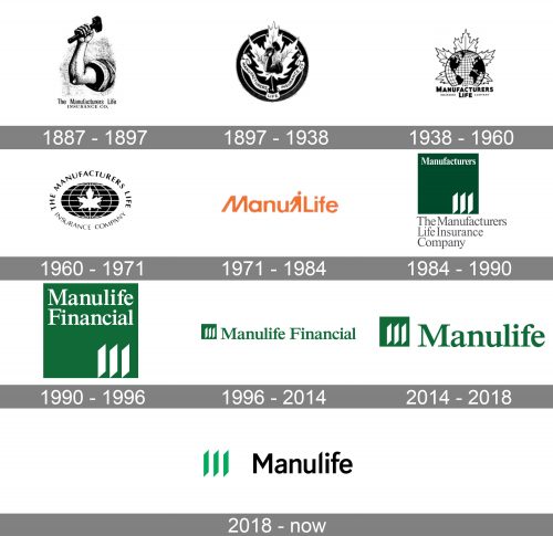
The Manulife logo has gone through a complete overhaul more than once. However, since 1984, it has stuck to green color and the same symbol (three parallel lines). Taking into consideration the long history of the brand, this series of updates can be regarded as a representation of the history of trends in logo design.
1887 – 1897 – The Manufacturers Life Insurance Company (first era)
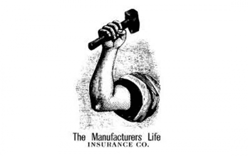
The original logo was the product of its era. It was as detailed as many logos of its time. In fact, we should better use the word “emblem” or “symbol,” as the notion of the logo didn’t exist in its modern form back then.
What is Manulife
Manulife is a Canadian financial services provider with assets of over $1.3 trillion (the US $1.0 trillion) under management and administration (as of the spring of 2021). The number of employees exceeds 37,000, and there are more than 118,000 agents.
The emblem showcased the arm of a worker holding a hammer. It was a decent representation of the target audience and probably helped to establish contact with it. On the other hand, it hardly said anything about the company’s specialization. Anyway, this job was done by the name of the brand itself.
1897 – 1938
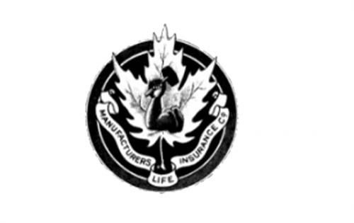
This update seems like a step back. The arm has grown smaller. At smaller sizes, it probably looked like a duck or a snake. The leaf stole the limelight and now became the centerpiece of the design. The banner with tiny letters only made matters worse.
1938 – 1960
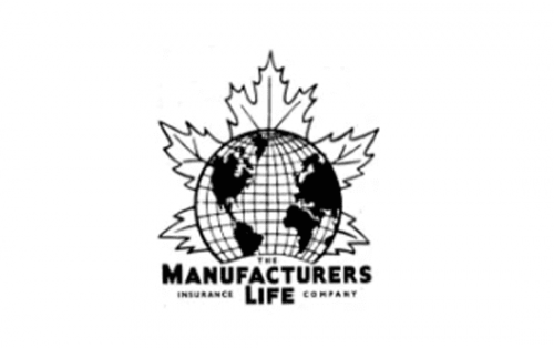
The arm disappeared. Now, the main message of the logo was probably the company’s global ambitions. They were represented by the globe at the forefront.
In spite of its clutteredness, this version looked a bit more modern than its predecessor. That’s because the banner, which reminded us of medieval coats of arms, was gone.
1960 – 1971
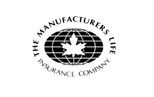
The design looks simpler, more appealing, and more effective. The leaf is now at the forefront, while the globe has moved behind. Both of them are drawn with fewer details.
The letters of the wordmark have grown much larger, which resulted in better legibility.
1971 – 1984 – ManuLife (first era)
This appears to be a rather successful attempt at a more contemporary logo. Now, there is only the word “ManuLife” in a distinctive shade of orange. What makes the design recognizable is the small human figure, which is apparently supposed to represent a manufacturer.
On the downside, the figure interferes with legibility and hardly looks like a worker.
1984 – 1990 – The Manufacturers Life Insurance Company (second era)
This is where the now-familiar emblem and the green color appeared for the first time.
1990 – 1996 – Manulife Financial
The whole wordmark is squeezed inside the green box. As a result, the logo eventually looks like a single whole.
1996 – 2014
The green box has been made smaller. The wordmark has been moved outside and has grown larger.
2014 – 2018 – Manulife
The shortened version of the name works better as it’s easier to read and remember.
2018 – present
The palette has grown a bit more vibrant. Now, it combines a lighter and more vivid shade of green with black. The sans serif typeface looks modern and has a unique touch due to the sharp top of the “l.”
Colors
In the 1984 Manulife logo, you can already see the green color, which has been used ever since. However, there was some playing around with the shade.


