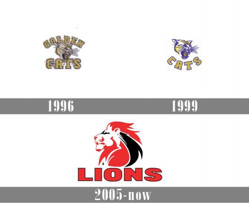
The Lions are a professional rugby union team from Johannesburg, South Africa. Taking into consideration they have changed their name more than once throughout their more than 20-year history, it’s only natural that the Lions logo hasn’t stayed the same, too.
Meaning and history
The team traces its roots to the club called Transvaal and then the Gauteng Lions.
Transvaal was the name used during the three years when the Super 10 competition ran (1993-1995). When the Super 12 competition started in 1996, Transvaal also took part in it. In 1997, they played under the name of the Gauteng Lions. This season has been remembered as a highly successful one, especially in comparison with the team’s first season.
1996 — 1998
From 1996 to 2005, the club played under the name of the Cats, or Golden Cats. The original logo depicted a cat’s head with the mouth open. You could see the sharp fangs conveying the aggressive and wild character of the creature (so that we could assume the players possessed the same qualities). The cat positioned his ears in the way they do when they quarrel with other cats.
1999 — 2005
The word “Cats” was placed below in a soft arch. The designer chose slightly unusual typography for it. The “C” and “S” didn’t have serifs, while the “A” and “T” featured rather heavy serifs.
The palette was utterly different from the current one. The cat’s muzzle was white and gold with a bluish purple outline. The letters were gold with white and blue outlines.
2005 — Today
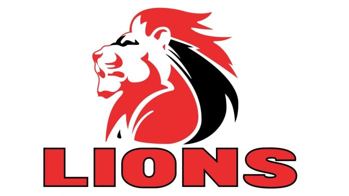
When the team was renamed the Lions in 2006, it adopted a completely different logo with a new color scheme. You could see a lion’s head facing to the left. The noble creature had a rich red and black mane with white streaks.
Font
The word “Lions” is given in large red glyphs. This is a more or less legible bold typeface based on the square shape.
Colors
Red, white, gold, and black are the only colors used on both the Lions logo and uniform. We can say, the combination of the colors and the bright shade of red are pretty popular in commercial design, yet it’s also eye-catching and emotional.
Historically, the team used other colors. The jerseys worn by the players in the Transvaal era were dark blue and white.


