LINE is the name of the popular online messenger application for smartphones and tablets, which was created in Japan in 2011. The messenger is a very strong competitor to such loud names as WhatsApp and Viber and is used by millions of people from all over the world, as has its versions translated into dozens of languages.
Meaning and history
LINE is absolutely free to download and use messenger, which allows its users to send Text messages, photos, videos, and all possible media files, make voice and video calls. Here you can create group chats for friends and family, or just talk to a person privately.
Apart from all the regular functions, LINE has a very important for many now security feature, where you can only give your user ID to a person, without sharing your phone number, thus the messenger is more than suitable for communicating with people you do not know too good yet. The application is also known for its huge and really cool collection of stickers and emojis. The stickers can be free or paid, there is always something to choose from.
Apart from all the described above features, LINE work like Instagram too, allowing you to share stories and save all photos in your feed, you and only you choose whether you want them to be seen by others or not.
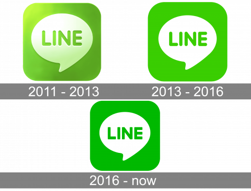
As for the visual identity, the application has been very stable since the creation of its original logo version in 2011. Only two light redesigns were held throughout the years, but everything from the idea to the color palette has been saved.
2011 – 2013
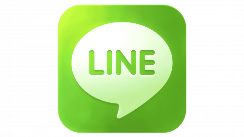
The initial LINE logo was introduced in 2011 and stayed unchanged for almost two years. It was a bright square emblem with rounded angles (normal web icon shape) in vivid green color with a voluminous white dialogue cloud, where the green rounded logotype was engraved. This was the only three-dimensional version of the LINE emblem, with a glossy surface of the white element and gradients of the green background.
2013 – 2016
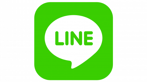
The redesign of 2013 made the LINE logo flat and simple, keeping the shapes and sizes of the previous badge. The main thing here was about the color palette, which got rid of any gradients and lights and started looking more professional and serious. The lettering was written in the same rounded sans-serif typeface, but with a darker shade of green the letters looked bolder and more stable.
2016 – Today
In 2013 the contours of the lettering on the LINE logo were refined and straightened up. The sans-serif typeface became more square and bold, which turned the badge into something solid and concrete. The shade of green was also enhanced and intensified, making the contrast with the white dialogue bubble cleaner and smoother.


