Le Coq Sportif is a French brand of sportswear, which is famous for creating official uniform for many French sport teams. It was founded in 1882 and started producing clothing and shoes under the iconic emblem in 1948.
Meaning and history
The brand’s name and logo celebrate a national symbol of France, the Gallic Rooster, which was first used by brand in 1948. The brand has a rich heritage, which is reflected in all the visual identity concepts through its history. Its background and roots are the strongest points and biggest values of Le Coq Sportif.
The Emblem
The iconic Rooster has been the main figure of the Le Coq Sportif emblem for more than 70 years by now. The emblem we see now was designed in 1968 and slightly modified during the brand’s history. The Rooster changes its direction and background, but the silhouette remains almost untouched.
The French tricolor palette of the emblem reflects the brand’s patriotism, and makes it elegant and strong.
1948 — 1950
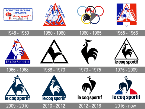
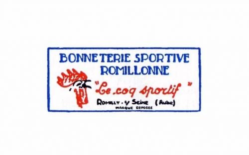
The first brand’s logo was composed of a wordmark and a small emblem on its left, enclosed in a rectangular frame. The wordmark consisted of two parts: strict and straight “Bonneterie Sportive Romillonne” in all-caps, and handwritten italicized “Le Coq Sportif”.
It was traditional for its time, more a tag than a logo.
1950 — 1960
The creation of graphical emblem. Le Coq Sportif triangular logo was designed. It was composed of an image of a rooster, enclosed in a triangle with stripes of blue and white, and a wordmark, placed around the perimeter of the emblem.
1960 — 1965
This time period’s logo is a celebration of Olympic Games. French team was wearing Le Coq Sportif garments, and the logo was composed of a rooster on a background of five colorful Olympic circles. The rooster itself features gray, black and red palette.
1965 — 1968
The Le Coq Sportif logo changes its form to a shield-like. The triangle with a rooster is placed inside, the wordmark is on the left and right faces of it. The logo became lighter due to the use of white color as the main, while blue adds a feeling of confidence and reliability.
1968 — 1972
In 1968 the brand designs the logo, which is the basis for the one we all know today. Simple and clean lines of a triangle with a refined blue silhouette of the rooster. It is modern, minimalist and stylish. The wordmark in a custom typeface is now placed under the triangle and is enclosed in a rectangular frame.
1972 — 1973
It was only for one year, that the brand used an abstract depiction of the rooster on its emblem. The solid blue “tick” inside the traditional Le Coq Sportif triangle is the only logo in the brand’s history, where the iconic bird is not detailed.
1973 — 1975
After an abstract logo, the brand changes its emblem to a single rooster silhouette, not framed, and without any lettering. It features the signature blue color and is a reflection of luxury and elegance of Le Coq Sportif products.
1975 — 2009
The logo designed in 1975 was used by Le Coq Sportif for almost 35 years. It is a blue framed white triangle with a blue rooster inside. The wordmark in all the lower case letters is executed in a blue custom typeface with confident and clean lines.
2009 — 2012
Le Coq Sportif changed its logo back to the 1968 version, where the rooster is bigger and stands out of its frame. It is more powerful and eye-catching, than the previous emblem.the wordmark is narrower and bolder, which reflects the brand’s expertise and authority.
2012
The current Le Coq Sportif logo features a blue rooster silhouette standing on the half of the circle, executed in the French tricolor palette. It is minimalist and sophisticated, evoking a sense of high-end fashion products and celebrating the rich brand’s history.
2016 – present
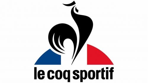
The redesign of 2016 brought back the French tricolor to the elegant Le Coq Sportif logo. The iconic black rooster is now standing on the half-sphere colored like the national flag of France. The lowercase logotype in a corporate sans-serif typeface is set right under the blue-white-red element, complementing the black rooster and balancing the whole badge.


