Labello is a brand of lip-care products, owned by Beiersdorf – a manufacturer of various personal care solutions. In particular, Labello sells lipsticks of several variations. These lipsticks are lasting and safe to use. They are mostly natural recipes without any mineral or synthetic ingredients. Labello is actually one of the longest-surviving lipstick brands in the world.
Meaning and History
The brand was introduced in Germany in 1909, when they started making so-called ‘lip salves’ – cosmetic and hygienic remedies for lips. The name derives from Latin words for ‘lip’ (labium) and ‘beauty’ (bellus). Stitched together, they create ‘Labello’. In general, it’s a very pleasant word that sounds feminine enough.
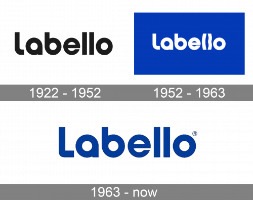
1922 – 1952
Their first ever logo was a white word ‘Labello’, written in cursive letters that looked mildly handwritten. These letters were rich in different twists and turns and were positively elegant. Usually, this wordmark would be put on some sort of light green background – rarer, dark green.
1952 – 1963
The 1952 wordmark was a different design. The characters in this name were mostly sans-serif letters, while the color stayed white. The only unique touch was in the very first letter. It was a curvy, thin shape that actually resembled part of the lips. Furthermore, the background was now bright red in most of these logos.
1963 – today
The later wordmark used typical sans-serif letters. They were prominently bold, rounded and with just a few unusual decisions. For instance, the first letter ‘L’ was much more abrupt than its neighbors. The coloring for these was blue or white most of the time, as well as red in the earliest designs.


