Meaning and history
Korean Air is the largest airline in Korea, it is considered the national carrier and has consistently provided air travel services to the Korean government. Moreover, Korean Air is one of the first founders of the global international airline alliance SkyTeam.
The history of Korean Air dates back to 1962. The company was founded on the initiative of the Korean government to replace the former Korean National Airlines. In a few years the airline took under its wing one of the largest Korean transport holdings, and in the early 1970s it began to operate cargo and then passenger flights to the USA.
Today, Korean Air has several subsidiaries, including China’s Okay Airways and Korean lowcoster Jin Air.The airline has domestic flights to about 20 destinations and international flights to more than 126 cities around the world. Naturally, Korean Air
What is Korean Air?
Korean Air is the name of one of the world’s top 20 carriers in terms of passenger numbers. Domestic flights are operated to 12 cities and international flights to more than 120 destinations, including nonstop flights to the Americas. The airline is a member of the SkyTeam alliance and one of its founders.
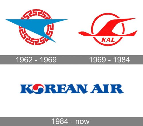
1962 – 1969
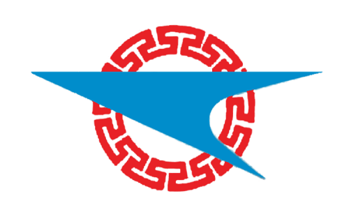
The first Korean Air logo was created in 1962 and only stayed with the air carrier for a few years. It was a modern and bright graphical emblem with no lettering on its official version. The badge featured a solid sky-blue triangular arrow, a stylized bird, pointing to the left, and placed a bit diagonally (up left), over the red circular frame. The frame boasted a geometrical ornament, looking like an ancient chain, formed by straight lines, resembling some Aztec-period drawings.
1969 – 1984
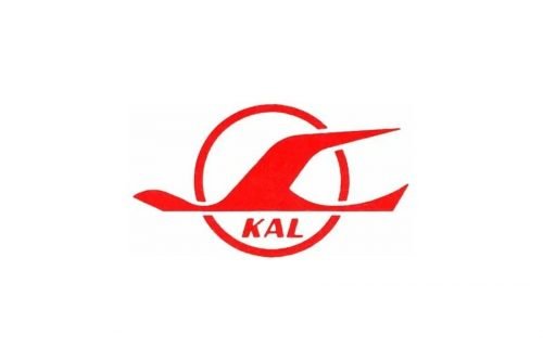
The old Korean Air logo features an abstract depiction of a bird, which can also be interpreted as a plane. The design is placed in front of a white circle with a red outline, which supposedly represents the sun. The lettering “KAL” (Korean Air Lines) can be seen below.
1984 – Today
The updated logo seems to have been inspired by that of Pepsi. At least the “O” made up of blue and white commas looks very much like the circle from the logo of the legendary soft drink.
Font and Color
The stylish and sleek lettering from the primary Korean Air badge is set in a custom font with softened lines and playful ends of the bars. The closest fonts to the one, used in this insignia, are, probably, Chicago Makers Extra Bold, or LTC Hess Monoblack, but with significant modifications of the contours.
As for the color palette of the Korean Air visual identity, it is based on the tricolor from the national flag of South Korea, blue, red, and white. This combination is one of the most sophisticated and powerful ones; with each color having its own meaning. Here blue is the shade of the sky, red — professionalism, and white — loyalty and security.


