Kobo is the name of an online bookstore, which was established in 2009 as Shortcovers and is owned by Rakuten since 2015. The platform offers thousands of e-books and other media materials for sale and operates globally through its website, having less than 500 employees.
Meaning and history
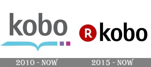
The visual identity history of Kobo can be split into two periods — the logo, created in 2010, right after the foundation of the company, and the one, designed to celebrate the acquisition of the service by Rakuten in 2015. Both of the versions are still in use today, moreover, there are two different logos for Kobo Rakuten — the one that is used for official documents, and another one, from the website and applications.
2010 — Today
The original Kobo logo was composed of a modern sans-serif inscription in the low-ercase placed above the stylized image of an open book, which was executed in sleek light-blue lines with two squares on the right, in light and dark purple.
The lettering itself featured a classy dark gray color, which looked professional and solid, elevating the look of the whole logo.
2015 — Today
The redesign of 2015 kept the style of the original lettering but made it black instead of dark gray. The blue book was removed and replaced by another graphical element — the iconic Rakuten red dot with the white capital “R” in the middle.
Another version of the emblem is composed of an entirely red wordmark, with the “Rakuten” in its corporate style and a sharp diagonal underline, and “Kobo” written in the lowercase in the right.


