The history of the Kenworth logo reflects the changes in major logo design trends. At the same time, however, it has remained loyal to its roots and heritage.
Meaning and history
The history of the brand started in 1912. It was founded in Seattle, Washington, as a car and truck dealership. The original name was Gerlinger Motors, which reflected the names of the two co-founders, brothers George T. and Louis Gerlinger, Jr.
Two years later, the brothers made a truck with a more powerful inline six-cylinder engine. This was the beginning of a long history of steady growth. The name “Kenworth,” which was adopted in 1923, consisted of the names of the new owners, “Ken” and “Worth” (from “Kent” and “Worthington”). The company has changed several owners.
Today, it belongs to Paccar and is its subsidiary. The brand is known as a manufacturer of medium and heavy-duty Class 8 trucks.
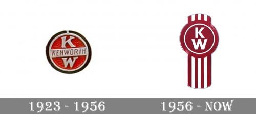
1923
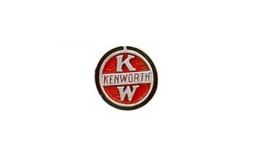
The oldest badge in this list looks somewhat dated and cluttered. Yet it was perfectly natural, if not innovative, for its era.
The core of the design is the combination of the letters “K” and “W” placed one above the other. In between, there is a silver plate featuring the full name of the brand in smaller and thinner letters. The design is placed inside a silver circle with red filling. There is also black trim encircling the badge.
1956
The two letters have preserved their role as the centerpiece of the logo. And yet, now they look different. They have lost their serifs and feature the strokes of the same width. Due to this, the type has a more minimalistic style, which corresponds to the epoch.
Also, the logo has lost the plate with the word “Kenworth” and the black trim, both of which work for the same overall effect.
There is also a new element, a combination of vertical silver and red stripes.
The word “Kenworth” can be added below the badge. It is bolder and better legible than in the original logo. The type is simpler and heavier, too.
Current versions
On the official website, you can come across at least two versions. While the first one reflects only the brand’s heritage, the second one (the corporate logo) establishes a link with the parent company.
The first logo looks pretty much like the 1956 version described above. Here, the lettering “Kenworth, The world’s Best” in black has been added to the right of the badge. There is a noticeable 3D touch.
The corporate logo looks flatter. Here, the roundel with the stripes is placed inside a white square with a red outline. To the right, there is a red square housing the name of the brand in huge white letters. Below, the writing “A Paccar company” in black can be seen.
Colors
The Kenworth logo has always featured silver and red or white and red. At some points, black has been added. The shade of red hasn’t been the same. Even today, the brand’s main logo seems somewhat darker than the corporate one.


