Kenmore is an American brand of household appliances, owned by the Seats company. Launched in 1913, Kenmore started from the production of sewing machines, however, as time passed, the brand widened its assortment and today it is well-known around the world for its freezers, refrigerators, washing machines, and many more. Also, the appliances under the Kenmore brand are produced by other large manufacturers such as Whirlpool, Panasonic, and LG.
Meaning and history
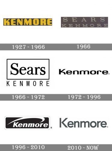
The visual identity of Kenmore was redesigned several times throughout the brand’s history, but it was always based on a wordmark, which was sometimes accompanied by light and delicate details, such as framing or underlining, nothing else, pure professionalism and modesty.
1927 — 1966
The original logo was created for the Kenmore brand in 1927 and stayed with it for almost forty years. It was a bright yet minimalist yellow inscription placed in a darn rectangular background. The capitalized logotype was executed in a bold rounded sans-serif typeface with smooth angles of the letters and straight cuts.
1966
In 1966 the brand was renamed Sears Kenmore and adopted a new logo, which only stayed for a few months. It was a badge with a two-leveled inscription in white, placed on a gray background. Both parts of the nameplate were executed in a traditional serif typeface with a lot of space between the letters.
1966 — 1972
Later in the same year, the logo was redrawn in a monochrome color palette. The “Sears” part was now enlarged and placed inside a rectangular frame. The wordmark featured an elegant and bold serif typeface, while the “Kenmore”, located under the frame, was written in all capitals of a modern and narrowed sans-serif font.
1972 — 1996
The redesign of 1972 was done when the brand’s name got changed back to Kenmore, so the new logo featured a smooth bold inscription in a title case, executed in a modern sans-serif typeface with wide contours and rounded lines. The monochrome color palette of the new emblem looked professional and confident.
1996 — 2010
The version of the Kenmore logo adopted by the brand in 1996 was executed in the same color palette but had a light graphical additional placed above the logotype. The new emblem was composed of a solid black rectangle with a white italicized lettering on it and a swoosh line placed above it. The wordmark was written in a bold and modern sans-serif typeface with thick lines and straight cuts of the bars. The arched line on top of the logotype softened the look of the badge and made it more elegant and feminine.
2010 — Today
In 2010 Kenmore redesigns its logo again and now there are two versions used by the brand: a gray logotype, written in a traditional sans-serif font and placed on a white background, and a more intense and bright monochrome badge, where the white “Kenmore” lettering in solace’s on the upper part of a solid black square with rounded angles. Under the white wordmark, there are two smooth intertwined white lines, which add uniqueness and tenderness to a minimalist and strict composition.
Font and color
The medium-bold title case lettering from the primary logo of the Kenmore brand is set in a modern geometric sans-serif typeface, which was designed exclusively for the company, yet has somewhat in common with such commercial fonts as Radikal, Stem, or Axiforma, with the Capital “K” completely modified.
As for the color palette of the Kenmore visual identity, its medium-dark shade of gray may seem boring or modest, however, it does make the laconic badge look elegant and stable, evoking a sense of professionalism and excellence.


