Kappa is a famous Italian brand of sport fashion, which was founded in 1916 as a little sock company. The brand we know today was created in 1967 in Turin. The brand became iconic for the fashion industry.
Meaning and history
Named after one of the letters of the Greek alphabet, Kappa has an instantly recognizable visual identity. Its bright logo is a symbol of authentic and sexy fashion, an icon or vintage street style.
What is Kappa?
Kappa is the name of the Italian fashion label, which is specialized in the design and production of sports apparel. The brand was established in 1978.
The Kappa logo was redesigned a few times in the very beginning of the brand’s history, and when they finally found the perfect symbol, it was only slightly modified.
Who owns Kappa?
Established in 1978 by Marco Boglione, today Kappa is owned by BasicNet company, which also owns such brands as K-Way, Superga, Briko, and a few others.
When the company was founded, it was focused on production of socks and underwear, and only in 1967 the Kappa brand we all know now was officially registered.
What does Kappa mean?
Kappa is the name of one of the letters of the Greek Alphabet, which sounds like “K”.
1916 — 1956
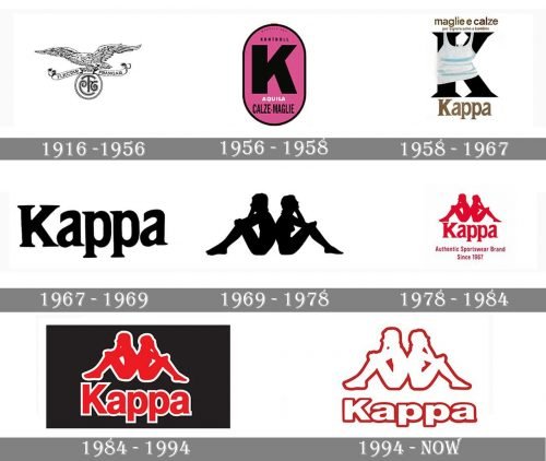
The first logo of Maglificio Calzificio Torinese (Kappa original name) was an image of a flying eagle, holding a circle emblem with “MCT” monogram. It was elegant and sophisticated, a proper representation of its times.
1956 — 1958
In 1956 the company changes its name to Kontrollen and the first letter “K” appears on the logo. It is an oval-shaped shield with a bright pink background and a bold and confident letter “K” executed in black.
1958 — 1967
The next redesign included also a name change — now the word “Kappa” appears under the black letter “K”, which is wearing a white tank-top. The “Kappa” wordmark is executed in a traditional serif font in a dark gold color.
1967 — 1969
The Kappa brand was officially registered and the logo now is composed of a bright red wordmark in think and confident lines. It is a simple and minimalist logotype, but it has style and power.
1969 — 1978
The most significant time period for the brand’s visual identity. The famous “Omini” emblem is designed. It is composed of two silhouettes — man and woman — sitting back-to-back. The emblem was created by accident during a swimwear catalog photo shooting.
It is executed in solid red on a white background. No wordmark is on the logo. It is a representation of support and equality of men and women.
1978 — 1984
In 1978 the wordmark “Kappa Sport” is added to the emblem. It is placed beyond the “Omini” sign and is executed in red thin sans-serif font.
In 1981 the word “Sport” is deleted from the Kappa logo, and the base of the today’s iconic visual identity is created.
1984 — 1994
In 1984 the typeface of the wordmark becomes bolder and stronger. Now the logo looks powerful and modern as never before. It is a reflection of influential brand that produces high-quality fashion items, a celebration of unique style and design.
1994 — Today
In 1994 the Kappa logo was redesigned. Now it is composed of a white emblem and wordmark, which have a red contour. It feels lighter and more contemporary now. A very confident work, that shows the brand’s heritage and its legendary fashion approach.


