Jollibee is the main brand of Jollibee Foods Corporation, a Philippine chain restaurant company. The history of the largest fast-food chain today began in 1975 with the opening of a cafe called Magnolia. Initially, the founder’s idea was to sell ice cream. After 3 years, the founders realized that they needed to close the ice cream parlor and refocus on fast food. They decided to use a bee as the logo of the new establishment, because this insect is extremely hardworking, makes honey, and generally gives joy. While a smiling bee has been present on the Jollibee logo since 1978, the design has grown more professional and distinctive since then.
Meaning and history
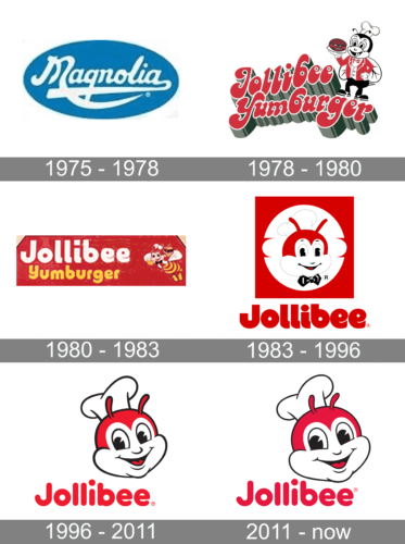
Jollibee Foods Corporation was founded in the Philippines in 1975 as an ice cream cafe and then transformed into fast food restaurant after the founder saw an opportunity to sell hot food. Now Jollibee is considered one of the largest companies not only in its native Philippines and Asia but also in the world.
Jollibee is known as the main competitor of McDonald’sin the local market and has its menu as a mix of KFC-style chicken, McDonalds burgers, and some pasta dishes.
What is Jollibee?
Jollibee is a chain of fast food restaurants, established in the Philippines in 1978. Today the company has more than 1500 locations in 12 countries all over the globe and is often called a gym rod between KFC and McDonalds. The brand is owned by the huge Jollibee Foods Corporation.
1975 – 1978
In 1975, three years before the word “Jollibee” was coined, Tony Tan, with much support from his family, founded an ice cream store in Quezon City, the Philippines. They called it Magnolia. The logo, which featured blue and white, seemed to have been inspired by the cold charm of ice. The name of the store was given in a beautiful script imitating handwriting. The “M” and final “a” sported extended ends, which formed underlines.
1978 – 1980
During this period, the full name of the brand was Jollibee Yumburger. The emblem featured the words in a font imitating handwriting. In comparison with the previous version, it was more legible. And yet, at least the “b” had a slightly unusual look and probably was somewhat difficult to decipher. The letters were red with a thin white outline and a green shade.
A winged insect could be seen at the top right corner. It looked rather friendly, although you wouldn’t say it was a bee if you weren’t aware of the shop’s name. The insect was dressed up like a combination of a cook and a waiter wearing a white vest, a red jacket, green trousers, and a white hood. In its paw, it was holding a hamburger on a plate.
While at this point, the company had five stores nationwide, it was growing very quickly, so the need for a more impactful logo emerged.
1980 – 1983
A new design was introduced in 1980. The name was now presented as a simple, flat inscription using a bold, sans-serif typeface. It was printed in two lines with the top being white and the bottom in yellow to go with the bee theme. The bee character was no longer standing idle. It was flying with a happy smile and bringing a yummy hamburger to everyone who visits Jollibee. The whole logo had a red background, which captured the attention and brought another element from the previous version.
1983 – 1996
The new Jollibee logo was simplified, which resulted in a more recognizable design. The bee, which remained the centerpiece of the image, wasn’t given in full height anymore. You could only see its head with a hood and a bow tie. This time, the friendly smile was more prominent, partly due to the size of the image. Behind the head, an outline of a sandwich could be seen.
The lettering “Jollibee” in a rather legible, yet creative script could be seen below. This has been the longest-lived logo so far. Even after a new version was introduced in 1994, the company was still using the old one for several purposes. For instance, you could see it in the restaurants’ decoration (before 2004), in packaging, and commercials (before 1999). The text was placed on the trays until 2006. Also, it was used on the website before its new version went online in 2009.
1996 – 2011
1996 was the year when the brand identity went through a complete overhaul. Not only a new logo was introduced, but also the restaurants themselves were decorated in a different way. While the visual core of the emblem preserved, it now looked by far more professional.
The bee’s face grew a bit more alive and emotional. The head was slightly bent to the side as if in a friendly nod. The smile was wider, while the bow tie disappeared. The lettering was given in a more rounded and utilitarian font with fewer details and more breathing space. While the previous version contained two registered trademark symbols, one was removed meaning only the ® near the text was left.
On the whole, the design grew more compact, minimalistic, and thus easier to perceive.
2011 – Today
This was a very subtle modification – you wouldn’t have noticed unless you compared the two versions side by side. There have been a couple of alterations in the way the bee’s face is drawn (take a closer look at the nose or the tendrils, for instance). The text was also altered, “b” probably most visibly. The registered trademark sign moved up.
Font
The insignia has gone the way from a rather elaborate script to a comparatively minimalistic typeface. Due to the rounded corners, it looks friendly and a bit plump. It can be a modified version of the font called VAG Rounded Pro Black or a similar font.
Colors
Red and black have been present on the Jollibee logo since 1978. Out of all the colors used on the previous logos, only these two and the white have survived.


