ITV is the name of the commercial tv-channel, which was established in 1954 in the United Kingdom under the name “Independent Television”, which was later shortened. Today the channel, mostly specialized in news and reality shows, is available in the UK and some European countries.
Meaning and history
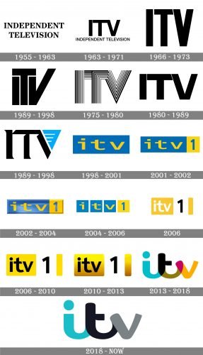
Being one of the oldest commercial channels in Britain, ITV has had a very intense history, and it was not only about the content or orientation but also about its visual identity which was redesigned more than 15 times throughout the years.
1955 – 1963
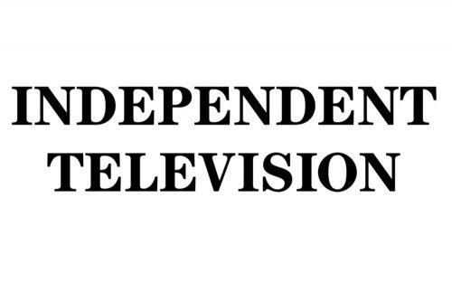
The first visual identity design for ITV was introduced in 1955 when the channel’s name was “Independent Television”. It was a strong and elegant wordmark in capitals, executed in a traditional serif typeface with bold lines. The wordmark was colored black and set in two levels.
1963 – 1971
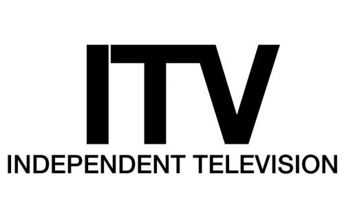
In 1963 the channel was renamed to ITV and the visual identity was redesigned in order to reflect the new name. The “ITV” wordmark in a minimalist sans-serif typeface was complemented by an “Independent Television” tagline, in the same font but it’s a more lightweight version.
1966 – 1973
In 1966 the tagline was removed and the main lettering gained a new bold and condensed sans-serif typeface, where letters became narrower and taller.
1973 – 1983
Another version of the logo was created in 1973. Both “I” and “V” of the inscription were placed under the horizontal bar of the “T”, and the letter “V” had its right bar elongated.
1975 – 1980
In 1975 the channel changes its emblem again. It is a bolder inscription in a black and white striped pattern, where all the stripes repeat the contour of the letters vertically and feature different thicknesses.
1980 – 1989
The logo from 1980 was one of the most minimalist and modest — simple sans-serif inscriptions, with only one unique detail — the “V” was overlapping “T” on the right side of its horizontal bar, and had a thin white diagonal line pointing on it.
1989 – 1998
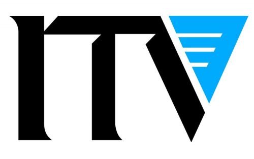
The color first appears on the ITV logo in 1989. It was a black wordmark in a custom typeface with slightly curved and pointed tails of the letters and a triangular connection of the bars. The right bar of the “V” was replaced by a light blue triangle with three white horizontal lines on it.
1998 – 2001
In 1998 the logo was completely redrawn. Now the yellow lowercase logotype was placed inside a solid blue horizontal rectangle. The new color palette stayed with the channel for almost ten years.
2001 – 2002
The channel was renamed to ITV1 for the period from 2001 to 2013, so the previous logo was complemented by a yellow square on the right with a blue “1” on it.
2002 – 2004
In 2002 the logo was made three-dimensional by adding gradient shades to both blue and yellow parts. The lettering got slightly extended, but the idea and the composition remained untouched.
2004 – 2006
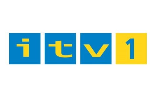
The blue rectangle was split into three squares, and now each letter was placed on a separate figure. The yellow square with the “1” was also separated from the blue part.
2006
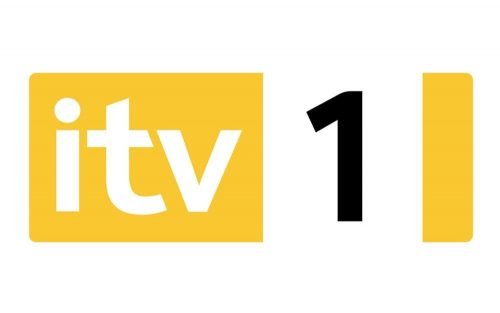
The new logo design was introduced by ITV in 2006. The Blue and yellow color palette was replaced by a yellow-white-black now, where the white lettering was placed on a yellow background with the black “1” on the right, placed on a white square.
2006 – 2010
In 2006 the “ITV” logotype was also colored black and used an elegant and modern sans-serif typeface with smooth soft lines and diagonal cuts of the “T” ends.
2010 – 2013
The nameplate became three-dimensional in 2010, as the designer added some dark gradient shades to the bottom part of the emblem. The typeface and the color palette of the visual identity remained the same.
2013 – 2018
The “ITV” name was brought back in 2013, followed by a major rebranding. The logo was redesigned in a modern and cool way, by removing all the elements except the wordmark itself. The inscription was now written in a bold custom font with all the letters connected with each other, and their smooth lines bold and sleek.
As for the color palette — each letter featured a separate color, so did the “overlapping” areas, and the colors could be changed depending on the background, though the official version boasted a stylish turquoise, dark green, and intense yellow palette.
2019 – Today
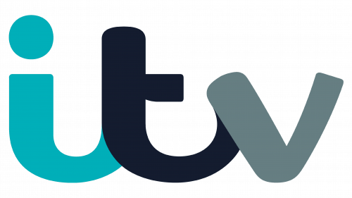
The logo was simplified in 2019, by removing the “overlapping areas” and drawing the wordmark in only three colors, which are solid turquoise, dark, almost black blue, and gray.


