Indian Airlines was the oldest government-owned airline in India, established in 1953 for domestic and regional flights. The company was Rembrandt’s in 2005, getting a new name – Indian. Indian Airlines was one of the leading air carriers in its country, with regional and international flights to 63 destinations and a fleet of 55 aircraft. The company was founded in the beginning of the 1950s, and rebranded in 2005, being renamed Indian. The daughter airline of Air India ceased its operations in 2011.
Meaning and history
Indian Airlines was established in 1953, and took a significant part of the regional flights of the main air carrier in its country, Air India. Until 2007 the company stayed independent, with the major rebranding taking place in 2005. Two years after the Indian name was adopted, the airline merged with Air India, forming Air India Limited, in the same year the company became a member of Star Alliance.
Indian Airlines was the only company in the world, which has been using A321 aircraft. From June 1989 to December 1994, 31 aircraft with reinforced landing gear struts were built for Indian Airlines, which was subsequently taken over by the Indian national carrier Air India.
What is Indian Airlines?
Indian Airlines is the name of a former air carrier, which was established in 1953 by the national airlines of India, Air India, and ceased all operations in 2011. The company had a fleet of 55 aircraft, and operated flights to more than 60 destinations across the globe.
1953 – 2005

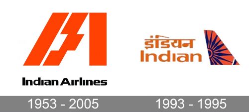
The original Indian Airlines logo was introduced in 1953 and stayed in use by the air carrier for more than half a century, which is a rare thing, but quite understandable, as that first emblem was unique and super stylish. The badge featured an enlarged orange “IA” abbreviation with the bold “I” inclined to the right, creating a parallel with the left bar of the “A”, which is visually divided into three segments and has the middle one sifted to the right. The black title-case logotype was set under the emblem, executed in a fancy and smooth sans-serif typeface with a hit extended and rounded contours of the letters, and the fonts above all lowercase “I”s removed.
2005 – 2011
The Indian Airlines’ visual identity is bright and memorable. It is composed of a wordmark and a colorful emblem on its right.
The wordmark is built in two levels — with the English inscription on the lower level, and the Hindu — on the top. The modern smooth sans-serif typeface of the English version is balanced by the ornate Hindu name. It looks bright and stylish in orange, the main color of the brand’s palette.
The Indian Airlines emblem is composed of a plane-wing image in a brighter orange with a purple abstract drawing on it. It symbolizes the sun, passion, and energy.
The symbol, used in the Indian Airlines emblem is a wheel from the Sun Temple at Konark. The wheel is very significant for the company and country, it represents motion and Indian heritage.
The orange and purple color palette of the Indian Airlines logo is a reflection of creativity, positive approach and power. There is also a touch of mystery, added by purple and a sacral symbol of the emblem. It is a remarkable and modern logo, which makes the company recognizable and progressive.
Font and Color
The heavy and stable lettering from the primary badge of a Indian Airlines is set in the title case of a modern extended sans-serif typeface. The closest fonts to the one, used in this insignia, are, probably, Grange Rough Demi Bold Extended, or PODIUM Sharp 9.8, but with some significant modifications of the contours.
As for the color palette of the Indian Airlines visual identity, it was based on a combination of orange and purple, the very bright and lively scheme, which made the air carrier stand out in the list of its competitors and evoked such senses as energy, motion, and determination.


