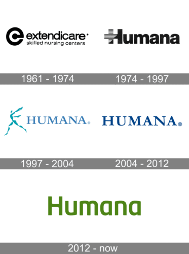
Humana is one of the three largest insurance companies in the USA, whose focus is health-insurance. The company was established in 1961 and today it has over ten million members and is in top100 of the Fortune500 ranking.
Meaning and history

The visual identity of Humana is still based on the name of the company, as it was in 1961 when the very first logo was created. Though there were not many redesigns of the company’s emblem throughout the years, the wordmark we all can see today is completely different from all the previous versions created and not only in its color but in an overall mood and style.
What is Humana?
Humana is the name of one of the Fortune500 American companies, which was established at the beginning of the 1960s and is focused on medical insurance services. Today, Humana is one of the three largest companies in the United States in its segment.
1961 – 1974
The very first logo, used by the brand, known today as Humana, was introduced in 1961 when the name of the organization was Extendicare. The badge, set in a black and white color palette, was composed of a laconic emblem, where the white lowercase “C” was drawn on a black lowercase “E”, followed by a lowercase inscription in a modern sans-serif font, with a “Skilled Nursing Centers” tagline in the same font, but thinner lines and smaller size.
1974 – 1997
In 1974 the company was renamed Humana, and a new logo was introduced. It was a black-and-white composition, consisting of a heavy title case inscription with the first capital “H” stylized. The left part of the character was executed in a horizontally-stripped pattern, while the right part and all the following letters were set in solid black. The inscription was set in an extra-bold sans-serif font, representing the reliability and trustworthiness of the organization.
1997 – 2004
The redesign of 1997 added a graphical part to the Humana logotypes which were also completely rewritten. The lettering was now set in all capitals of an extended serif typeface with massive traditional contours of the letters. The logotype was drawn in solid blue and placed on the right from a delicate and airy emblem, depicting a running man in light blue.
2004 – 2012
In 2004 the graphical part was removed from the Humana visual identity, and the only logotype remained. It was executed in the same typeface as in the previous version, though the shade of blue was elevated to a more delightful one. The modest and laconic logo of Humana evokes a sense of confidence and expertise in the company.
2012 – Today
The redesign of 2012 switched the familiar blue and white color palette of the Humana logo to a green and white one. As for the style and composition, the new logo is composed of a title-case inscription in a fancy modern sans-serif typeface, with no additional elements or framing.
Font and color
The stylish and strong Humana logotype is executed in a modern sans-serif typeface with rounded lines and pointed angles of its upper- and lowercase letters. The typeface of the inscription is very close to such commercial fonts as Neo Tech Std Medium and Bunday Clean Semi Bold.
The calm green color of the Humana visual identity is a representation of unity, well-being, and success. It also reflects the caress of the company about its customers and its progressive approach to development and new services.


