The tax preparation company H&R Block is headquartered in Kansas City, Missouri, U.S. Apart from the US, it also works in Canada and Australia and has around 12,000 retail tax offices.
Meaning and history
Brothers Henry W. Bloch and Richard Bloch started the family business in 1955. Since then, the typography of the H&R Block logo has remained virtually unchanged, although the overall look has been modified more than once.
What is H&R Block?
H&R Block is the name of an American company providing tax preparation services. It was established in the middle of the 1950s, and named after the two brothers-founders, Henry and Richard Bloch. Today the company operates not only in the USA but also in Canada and Australia.
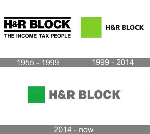
1955 – 1999
The original version already showcases an austere sans serif typeface. The thickness of the strokes is almost the same in every part of the wordmark, except for the thinner ampersand and a couple of other details.
There is a horizontal line both below and above the wordmark. Below, comes the tagline “The Income Tax People,” which features smaller and lighter sans.
1999 – 2014
The design has grown simpler, more vivid, and better memorable.
Now, there is a green square to the left of the wordmark. The wordmark looks lighter, and you can notice a couple of alterations in the shape of the glyphs (note, for instance, the “R” and the “K”). The lighter type has sacrificed some of the “stability” quality of the previous logo for the “modern” feel.
The green square doesn’t seem to have a more or less direct symbolic meaning (like, for instance, if they had coins on their logo). It should be interpreted in a more abstract way. The square shape is associated with reliability, stability, and order. Some of the most popular associations with green are balance, stability, and relaxation. So, if we try to understand why the tax preparation company could use this emblem, we can assume they wanted to say something like “We are reliable enough to take care of your money and paperwork, while you can relax.”
2014 – present
The bolder weight has returned to the H&R Block logo – in this respect, it reminds the original 1955 version. Yet, the shape of the letters is more consistent. The “R,” for instance has a straight and shorter leg, which better fits the “stability” concept of the logo. The ampersand is larger – it is as tall as any other glyph.
What’s even more notable, the proportions of the square are different. The square has grown closer to the size of the letters, although it is still slightly larger.
In addition to the regular logo, there is also a version, where the name of the company in white is placed inside the square.
Font
The type looks pretty much like Coflax Black. It is a geometric sans developed by Eric Olson and published by Process Type Foundry in 2012.
Colors
Since 1999, the H&R Block logo has used a bright and rather light shade of green as its main color.


