During more than 110 years of its history, Honeywell has gone the way from an intricate Gothic logotype to a minimalistic and modern brand identity.
Meaning and history
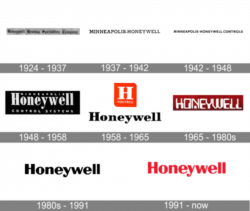
One of the earliest wordmarks, which was adopted at the beginning of the 20th century, was given in a Gothic script. The logo versions used in the 1930s and 1940s featured the text “Minneapolis Honeywell Controls” in much simpler fonts.
1924 – 1937

Their first logo had their full name, ‘Honeywell Heating Specialties Company’ written in black Gothic letters, in a single line.
1937 – 1942

In 1937, this writing was transformed into ‘Minneapolis • Honeywell’. The font changed to a more natural serif with blocky tails.
1942 – 1948

In 1942, they went for a full sans-serif look and also added the word ‘Controls’ right after ‘Honeywell’.
1948 – 1958

The 1948 design was a black rectangle with ‘Honeywell’ written in the middle, using bold serif letters. In the space between ‘H’ and ‘ll’, they’ve put the word ‘Minneapolis’ in smaller sans-serif writing. Beneath them both, there were words ‘control systems’ written in the same style.
1958 – 1965

The 1958 design uses a similar wordmark style, except with black, shorter letters. Above it, there was also a red square with a white ‘H’ in it and a small word ‘Honeywell’ beneath it.
1965 – 1980s

This emblem is a red rectangle with the name written in white in it. The font here is more futuristic – there are straight lines with abrupt corners and slightly jagged shapes.
1980s – 1991

The following design is just the wordmark from 1958, but without the serifs and with some minor alterations.
1991 – Today

The 1991 emblem is the same wordmark, but colored red instead of black.
Emblem colors
The Honeywell logo features a bright shade of red (Pantone 485C, hex: #DE0031) on the white background (hex: #FFFFFF), while the primary palette also includes black (hex: #191A00).
Font
The sans serif typeface looks very much like the Britannic Bold font.


