

![]() China Mobile Logo PNG
China Mobile Logo PNG
The Chinese telecommunication corporation China Mobile has two main logos.
Meaning and history
![]()
China Mobile is the largest mobile network operator not only in China but in the whole world, with more than 900 million subscribers in several countries around the globe.The main shareholder of the company is the State.
China Mobile operates in China, Hong Kong, Pakistan, Japan, Thailand, and Singapore, along with the United Kingdom, Canada, and Italy. The company keeps expanding and opening new markets, signing agreements in a few more countries, for example, Kazakhstan.
What is China Mobile?
China Mobile is the name of a Chinese telecommunication company, which was established in 1997, and by today has grown into one of the leaders of its region. The company operates in several countries, including China, Hong Kong, Japan, the United Kingdom, and a few others, providing its customers with such services as mobile and fixed telephony, and digital and broadband Internet.
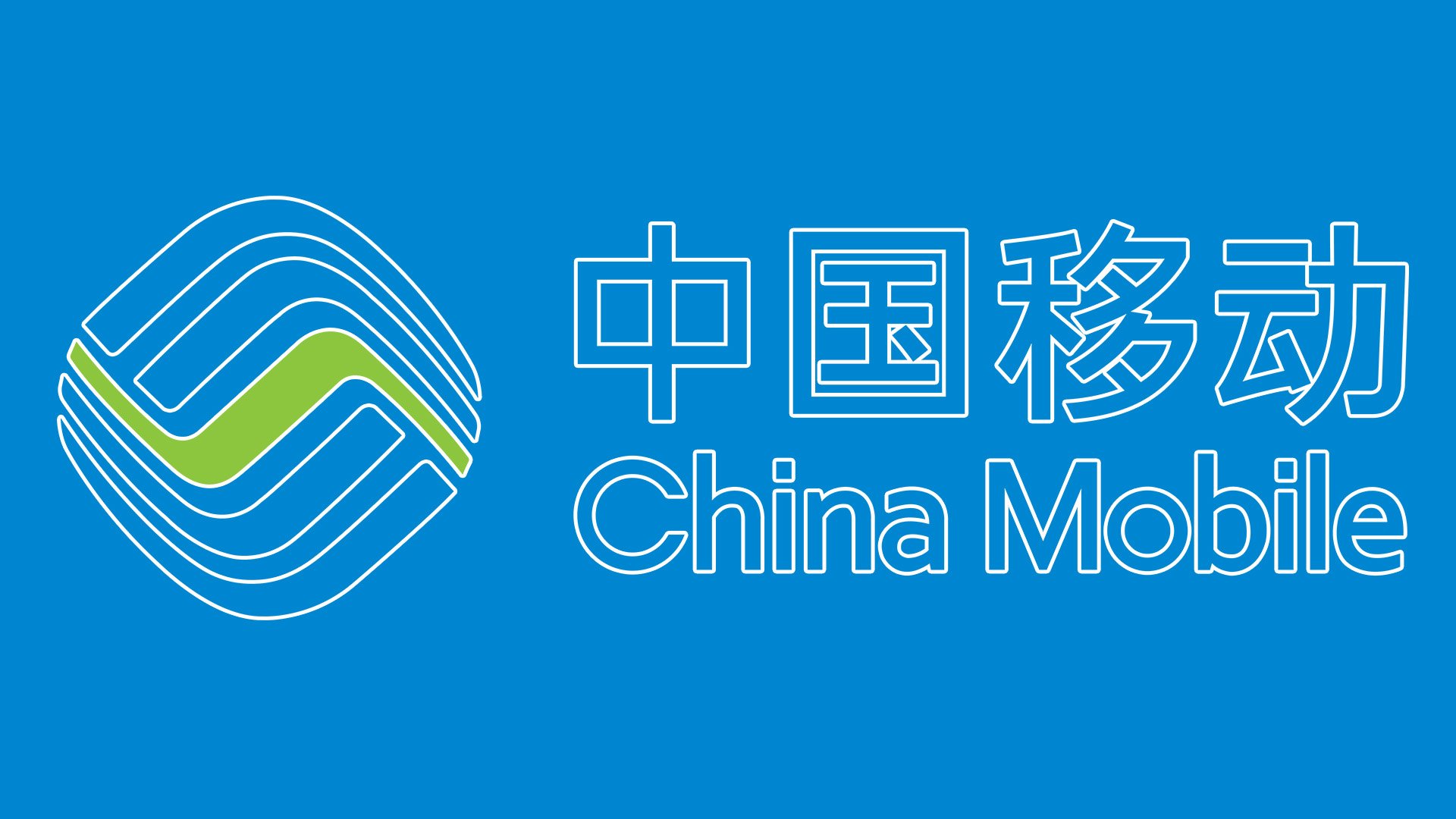
1997 — 2013
![]()
The China Mobile logo created in 1997 was executed in a blue and white color palette and looked very simple yet professional and strong. The logo was composed of a graphical emblem and lettering in two languages and two levels, placed under the emblem. The upper line of the inscription contained the name of the company in Chinese, while the bottom one — in English. Both levels were executed in the same style, with clean thin blue lines forming the traditionally shaped blue letters. As for the emblem, it was a stylized rhombus with rounded angles and blue as the main color. The abstract white image was placed over it. Composed of several arched lines, it resembled waves, or the letter “S”.
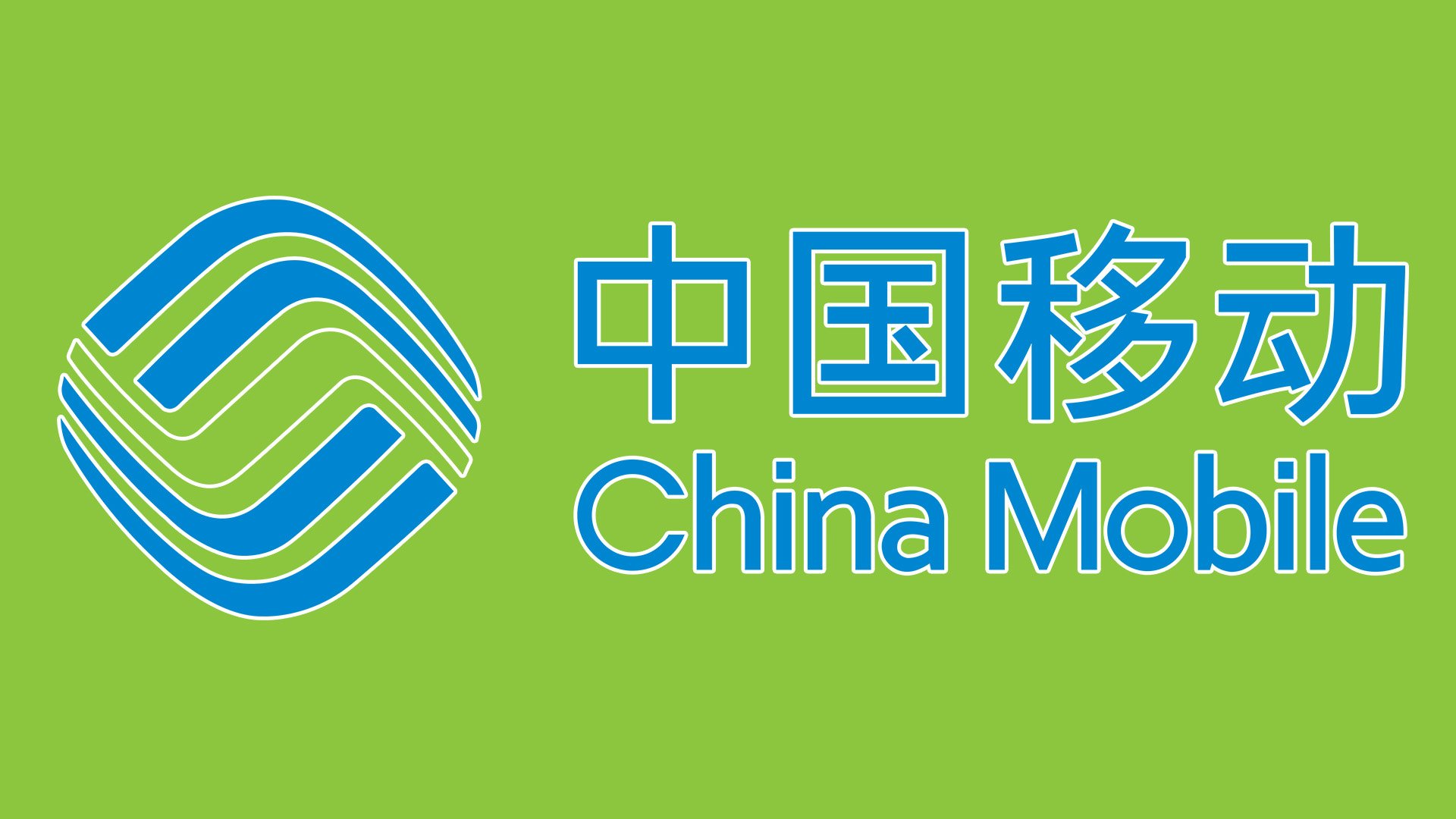
2013 — Today
![]()
The redesign of 2013 kept the corporate emblem of the company, but redrew it in a blue and green color palette, pleasing the lines on a white background. As for the wordmark, it was now placed on the right from the graphical logo part, written also in two languages, but this time the English version was executed in a title case.
Corporate emblem
The corporate China Mobile logo consists of an abstract emblem and the name of the company in two languages, Chinese and English. The combination of light blue and light green looks natural and soft like a green meadow under the summer sky.
“And” symbol
The company used to have several brands that have been phased out by an umbrella brand And. Its emblem comprises an exclamation mark, the Chinese hieroglyph meaning “peace,” and the word “and” in English. Here, the color scheme is more vibrant – the combination of neon green and fuchsia grabs your attention.
Font and Color
The modest and tender lettering from the primary badge of China Mobile is set in a very simple medium-weight sans-serif trifecta with clean contours and a feeling of lightness. The closest fonts to the one, used in this insignia are, probably, New Lincoln Gothic BT Std Semi Bold, or Identikal Sans, with some minor modifications of the contours.
As for the color palette of China Mobile’s visual identity, it is based on vivid and delightful shades of green and blue, which look fresh and evoke a sense of happiness and reliability. The badge looks very bright and represents the professionalism, loyalty, and experience of the company.


