Holden is the name of an Australian automaker, which was established in 1856 and got acquired by General Motors in the 1930s. In the first years after its foundation, the company was producing saddles and accessories and switched to car manufacturing at the end of the 1900s.
Meaning and history
The visual identity of one of the oldest Australian car marques has always been based on an image of a lion, an animal synonymous with power, courage, and majesty. But the Holden logo has also a more interesting meaning.
The badge, nicknamed “Lion and the Stone” is a graphical representation of the wheel invention. According to the legend the wheel was invented after people observation of lions Rolling Stones.
1928 – 1969
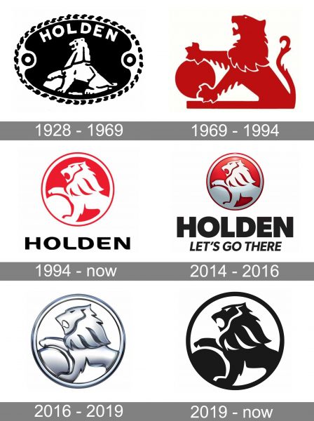
The original Holden logo was designed by Rayner Hoff in 1928 and depicted a lion in profile, sitting and holding his paw on a rounded stone. The image was enclosed in an oval ornate frame and had an arched “Holden” wordmark in all capitals above it. This emblem was executed in monochrome, with black as the main background color.
1969 – 1994
In 1969 the logo was redrawn for the first time — the framing and inscription were removed, and the lion with a stone — refined. The animalistic emblem was now executed in red and placed on a white background. This emblem can still be seen on some of the brand’s materials.
1994 – Today
A modern emblem was introduced in 1994. The white lion on a red circle, enclosed in a double white and red frame had a black wordmark under it. The lines of the mascot were refined and softened. The sleek and elegant image was balanced by a strong yet also smooth inscription in all capital letters of a modern sans-serif with rounded angles.
2014 – 2016
The badge became three-dimensional in 2014. The gradient shades of gray and red were added to the emblem, while the lettering was redrawn in a more massive and brutal typeface. On this version of the logo the motto “Let’s go there” appeared under the nameplate.
2016 – 2019
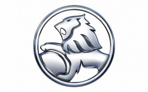
The redesign of 2016 simplified the Holden color palette to silver and black. The three-dimensional badge in gradient metallic gray had its contours kept from the previous version, yet looked completely different without the usual red background. It became lighter and more elegant.
When the wordmark was used with the emblem, it was written in black, with its title case lettering executed in a smooth sans-serif typeface with softened angles and diagonal cuts of “L” and “D” vertical bars. Sometimes the inscription was accompanied by the motto in lightweight italicized font.
2019 – Today
The Holden logo, introduced in 2019 featured the same contours and style of the badge, but now it is flat and executed in black. Placed on a white background, the lion evokes a sense of power and might, showing the brand as a reliable and confident one.


