

![]() Henkel Logo PNG
Henkel Logo PNG
German chemical and consumer goods company Henkel AG & Company is based in Düsseldorf, Germany. It was established in 1876.
Meaning and history
![]()
Henkel’s brand identity is an example of impressive consistency. For decades, the Henkel logo has remained unchanged. In spite of this, it does not look dated or old-fashioned. The red wordmark featuring such a clean sans serif type perfectly suits the modern design requirements.
1920
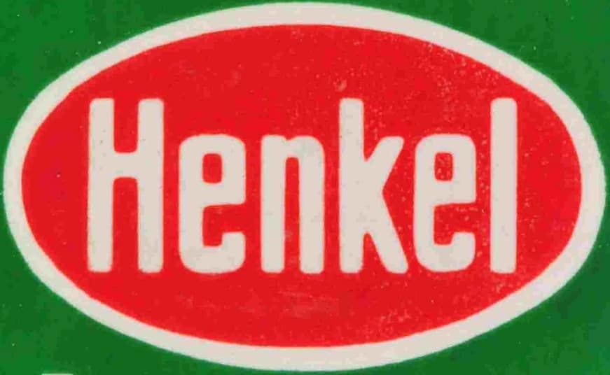
The original Henkel logo was created in 1920 and featured a simple yet bright combination of a solid red oval in a white outline placed on a grass-green background. The oval was stretched horizontally and contained a bold narrowed “Henkel” inscription in white sans-serif letters. The color palette of the first brand’s logo stood for progressiveness and success, and brilliantly represented the character of the company.
1950

The redesign of 1959 simplified the color palette of the Henkel visual identity, removing green and keeping only red and white elements. The solid red oval was now placed directly on a white background and had the white sans-serif lettering in the title case as the only additional element. The letters of the inscription became more confident and square in comparison to the previous logo version.
1954
In 1954 the contours of the Henkel logotype inside the red oval badge were refined and cleaned. Now the nameplate started looking more elegant and professional, as the letters became a bit smaller and their lines — thinner. As for the color palette and overall mood of the emblem, they remained the same.
1959
The lettering became a bit bigger again in 1959. It was a golden middle between the two previous versions of the Henkel visual identity, with the refined contours of the inscription and the original color palette of the brand’s iconic badge.
1965

In 1965 the contours of the red oval were cleaned and the thin double white and red outline was added to it. As for the lettering changed, it was changed and the new sans-serif typeface of the white inscription had wider contours and more elegant shapes, with some traditional rounded lines and distinct cuts. The red color was slightly elevated, becoming brighter and more delightful. This logo was used by Henkel for twenty years.
1985
![]()
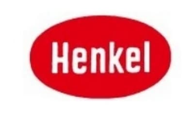
In 1985 the brand starts using a reversed version of the logo, created in 1965. Today it is a white horizontally stretched oval in a thin red outline with a sleek yet confident and professional red lettering in the middle. The typeface remained untouched, though started looking bolder due to the use of bright red for its letters.
Font and color
![]() The visual identity of Henkel looks very strong and professional, due to the use of a simple yet confident and clean sans-serif typeface for its logotype, which is the main part of the brand’s identity. The Henkel inscription is executed in a traditional font, which is pretty similar to Nimbus Sans D Bold, Sequel Sans, and Helvetica.
The visual identity of Henkel looks very strong and professional, due to the use of a simple yet confident and clean sans-serif typeface for its logotype, which is the main part of the brand’s identity. The Henkel inscription is executed in a traditional font, which is pretty similar to Nimbus Sans D Bold, Sequel Sans, and Helvetica.
The Henkel logo is executed in a laconic yet powerful red and white color palette, which represents the power, passion, professionalism, and expertise of the company, showing it from its strongest sides and accenting on them.


