Hastings Direct is a dynamic, rapidly expanding general insurance provider in the UK, offering a wide array of products and services. They provide insurance options for cars, bikes, vans, and homes, along with other products such as breakdown cover and legal expenses for home. Their operations are robustly supported by data and digital platforms, enabling them to cater to customers effectively through phone and internet. As of December 8th, 2021, Hastings Direct is part of the Sampo Group, a Finnish financial company.
Meaning and history
Hastings Direct, established in 1997 by David Gundlach and Andrew Bowen, has experienced significant changes in ownership and expansion over the years. In 2006, the company was acquired by Insurance Australia Group, then taken over by its management in 2009. A noteworthy development occurred in 2011 when Hastings Direct announced the creation of 150 new jobs. Goldman Sachs acquired a 50% stake in the company in 2013, and Hastings Direct went public in 2015. The company’s most recent major change came in 2020 when Rand Merchant International and Sampo Group, a Finnish insurer, acquired it for £1.7 billion.
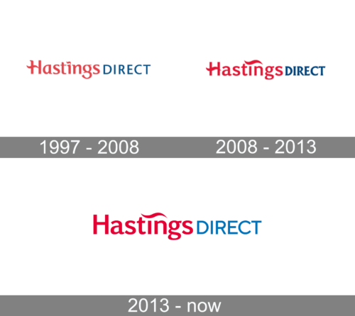
1997 – 2008
The logo is executed in a refined and straightforward typography, featuring the word “Hastings” in a prominent red, signifying vitality and strength. “Direct” follows in a lighter grey, symbolizing balance and a calm, professional demeanor. The use of lowercase for “Direct” contrasts with the capitalized “Hastings,” which might be interpreted as a strategic emphasis on the brand name.
2008 – 2013
The logo is a minimalist and contemporary design primarily in red and blue. The company name “Hastings Direct” is rendered in a clean, sans-serif typeface, with “Hastings” in a rich red and “Direct” in a classic blue. The red color conveys passion and energy, while the blue represents trust and dependability. A distinctive red swoosh arches above the ‘i’ in “Direct,” adding a touch of dynamism to the overall design. The simplicity of the logo ensures versatility and memorability, reflecting the company’s modern and straightforward approach to its business.
2013 – Today
The brand name is split into two different color schemes, with “Hastings” in a vibrant red and “Direct” in a deep blue. The font is sans-serif, modern, and clean, with a dynamic red wave accentuating the letter ‘H’ in “Hastings,” giving a sense of movement and fluidity. This red wave could symbolize progressiveness and the flow of ideas, while the blue for “Direct” suggests professionalism and reliability. The overall design is simple yet bold, effectively communicating the brand’s identity.


