Although at first glance, the Haier logotype may seem somewhat plain, if you take a closer look, you will notice the unique features making it recognizable.
Meaning and history
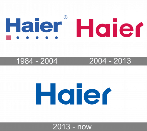
The original wordmark introduced in 1991 sported an eye-catching, to say the least of it, shade of pink. The logo included only the company name without any images, yet the last letter actually looked more like a turn of the road than an “r.”
1984 — 2004

Their oldest logo had their name written in blue letters, using a normal sans-serif style. Below it, there was a red square with 5 blue dots arranged in a line.
2004 — 2013

The original wordmark was of a bright shade of red. While this color made the logo more eye-catching than the current one, it also lacked the “cool” feel. It isn’t very appropriate, when a logo of a company best known for its refrigerators and air conditioners feels “hot.” The fact that the red was slightly cooled down by a subtle addition of blue didn’t help – it still stayed red (the color associated with flame and heat). So, the change of color that took place in 2013 appears perfectly natural.
Another notable difference was the shape of the dot above the “i” – it used to be a square. It made the design heavier and emphasized the reliability of the Haier products, while the current shape (circle) emphasizes the stylish look of the products and their ability to fit any surrounding.
2013 — Today

While preserving the overall looks of its predecessor, the new wordmark included slightly tweaked letters. The “r” became smoother, the “a” grew larger, the “i” got a circle dot instead of a square one.
Font and Colors
The wordmark seems to be based on the ITC Avant Garde Demi Bold, which is especially noticeable in the first part of the word. Most letters were tweaked by hand, while the “r” was probably drawn from scratch.
The dark, saturated shade of blue featured on the Haier logo stands out on the white background.


