Gorillaz is a British virtual band blending music and animation, created by musician Damon Albarn and artist Jamie Hewlett. It’s famed for its unique concept where animated characters, rather than real-life musicians, serve as band members. This innovative blend of various musical styles and visual art was conceived in London. It aims to offer a satirical take on pop culture and the music industry, using the virtual platform to explore diverse musical collaborations and storytelling through its animated universe.
Meaning and history
Gorillaz, a brainchild of Damon Albarn and Jamie Hewlett, emerged in 1998, revolutionizing music with their digital persona. Based in London, this virtual band’s narrative unfolds around animated members – 2D, Murdoc Niccals, Noodle, and Russel Hobbs. Their self-titled debut in 2001, featuring the hit “Clint Eastwood”, marked a new era in music, blending rock, hip-hop, and electronica. Albums like “Demon Days” and “Plastic Beach” followed, acclaimed for their eclectic sound and social commentary.
Collaborating with diverse artists, Gorillaz transcends traditional music boundaries, creating a unique, multi-genre soundscape, while their virtual identity satirizes and celebrates pop culture.
What is Gorillaz?
Gorillaz stands as a pioneering virtual band, blending animation with eclectic music styles. Conceived by Damon Albarn and Jamie Hewlett, it features animated characters as band members, weaving a distinct narrative through diverse musical landscapes. This creative venture, originating from the UK, challenges conventional music presentation, merging art and sound in a novel way.
1998
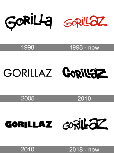
The logo features bold, irregular letters that appear to be hand-drawn, evoking a sense of playful energy. The word “Gorilla” is stylized with exaggerated loops and curves, giving it an animated, almost living character. The black ink against a plain background ensures high contrast, capturing attention and making a strong visual statement. The letters’ varying sizes and the fluidity of the lines suggest creativity and movement, reflective of an artistic, non-conformist identity.
1998 – Today
This rendition of the logo trades stark black for a vivid red, infusing it with vitality and boldness. The red hue conveys passion and dynamism, potentially reflecting the energetic essence of the band’s music. Drips at the end of some letters add a raw, graffiti-like quality, suggesting an urban edge and a rebellious spirit. The letters are less uniform than before, with more pronounced irregularities and varying thickness, which could signify a more organic, handcrafted image. This logo retains its playful character while embracing a fiercer, more striking color palette.
2005
Switching back to black, this logo opts for a cleaner, more streamlined aesthetic. The logo presents a stark, minimalist design with bold, sans-serif typeface. Each letter is uniformly black, standing out crisply against a white background. The font’s geometric precision conveys a modern, clean aesthetic, evoking a sense of professionalism and straightforwardness. There’s an air of confidence in the simplicity of the design, suggesting a brand that is self-assured and uncluttered by excess. The straight lines and perfect circles within the letters offer a balance, reflective of the band’s harmony between visuals and music. The overall effect is one of refined clarity, emphasizing the name itself without distraction.
2010
The font is bold, with a modern twist, marked by sharp angles and clean lines, suggesting a sleek, contemporary feel. The letters are interconnected, symbolizing unity and a seamless blend of styles, mirroring the band’s collaborative essence. The addition of a shadow effect adds depth, hinting at the multifaceted nature of the band’s music and persona. This design speaks to a matured identity, maintaining its iconic character while embracing a more refined presentation.
2010
This logo iteration presents a return to simplicity, with solid, bold, sans-serif characters against a stark backdrop. The design eschews angles for smooth, rounded contours, conveying a friendly yet commanding presence. Absent are any embellishments or shadows, suggesting a stripped-down approach that focuses on clarity and readability. The uniformity in letter size and the absence of linking elements between characters represent an evolution towards a more classic and timeless design, emphasizing the band’s enduring nature in the ever-changing music landscape.
2018 – Today
The logo has transformed into a striking, brushstroke style, exuding a rough, artistic flair. Black paint-like strokes replace the previous logo’s clean lines, suggesting a more rebellious and raw edge. This handcrafted approach gives off an impression of spontaneity and echoes street art’s transient beauty. The uneven edges and varying stroke widths imbue the design with a sense of motion and an almost musical rhythm, aligning with the band’s dynamic and innovative spirit. The organic, almost improvised feel marks a stark departure from the previous logo’s polished geometry.


