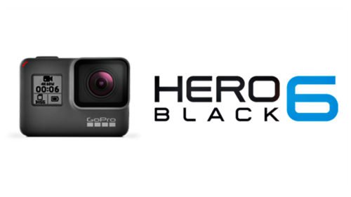
Adventurous folks around the world make their own videos with action cameras adorned with the GoPro logo.
Meaning and history
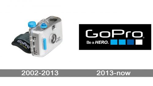
The company was founded in 2003. It didn’t take its product much time to gain popularity, the more so because the logo calls for an active lifestyle.
2002 — 2013
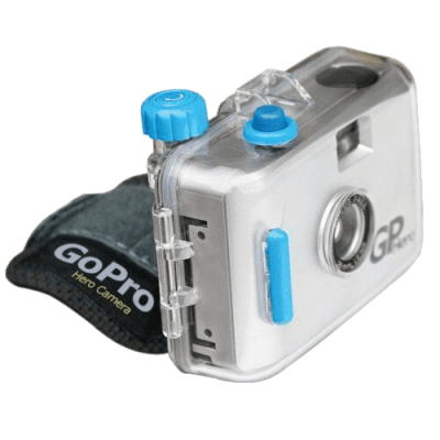
The original GoPro logo wasn’t unlike the current one. It also featured the name of the brand in white over the black background. The letters were pretty simple and belonged to a sans serif typeface.
However, the old type lacked the unique touch of the current one. Also, its proportions were different – the old version featured more elongated characters with an oval base, while in the current version, they are flatter and are based on a rectangle with rounded corners.
The previous version also mentioned the hero theme, although the tagline used to be slightly different (“Hero camera”).
2013 — Today
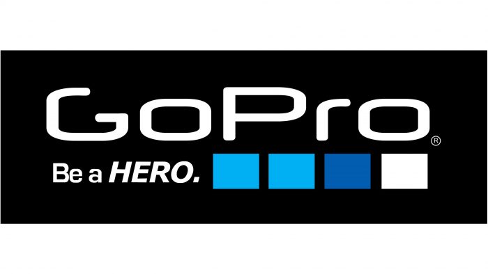
The GoPro logo includes the company name, the slogan “Be a HERO” and a graphic symbol consisting of four boxes. The “GoPro” is above. The boxes are in different shades to denote different areas where wearable action cameras produced by the company can be used.
The first box (from the left) refers to land-based extreme sports ‒ motocross, downhill and cross-country biking. Its color symbolizes the sky. The second box represents surf. The third one stands for underwater activities. The rightmost box is white to signify snow sports.
Color
The palette of the GoPro logo includes 3 colors. They are Vivid Cerulean (#00AEEF), Medium Persian Blue (#005DAC) and White (#FFFFFF).
Font
The company identity mark makes use of three different fonts. The design of “GoPro” is most likely built on the Neuropol font, except for the letter “G” which was slightly modified. The slogan features Eurotile Bold for the “Be a” and Verdana Bold Italic for the “HERO”.


