 Gol Linhas Aéreas Inteligentes Logo PNG
Gol Linhas Aéreas Inteligentes is a Brazilian airline that provides domestic and international flight services. It was founded in 2001 and is owned by the Constantino family. The company operates out of São Paulo, Brazil, with its main hub at São Paulo-Guarulhos International Airport. It serves various destinations across South America, including major cities in Brazil and neighboring countries. Gol Linhas Aéreas Inteligentes has established itself as a prominent player in the aviation industry, offering a range of services and maintaining a strong presence in the Brazilian market.
Meaning and history

GOL Linhas Aéreas Inteligentes, commonly known as GOL, is a Brazilian low-cost airline founded in 2000. It operates a vast network of domestic and international flights, connecting passengers to numerous destinations in South America, the Caribbean, and the United States. GOL is recognized for its affordable fares, efficient operations, and innovative services. The airline offers a variety of onboard amenities, including complimentary snacks and beverages, as well as a loyalty program for frequent flyers. GOL operates a modern fleet of Boeing aircraft and prioritizes safety and customer satisfaction. With its extensive route network and commitment to providing accessible air travel, GOL has become one of the leading airlines in Brazil and the region.
What is Gol Linhas Aéreas Inteligentes?
Gol Linhas Aéreas Inteligentes is a Brazilian low-cost airline that operates both domestic and international flights. It is one of the largest airlines in Brazil and offers affordable air travel options to various destinations. With a focus on innovation and efficiency, Gol Linhas Aéreas Inteligentes aims to provide a smart and accessible flying experience to its passengers.
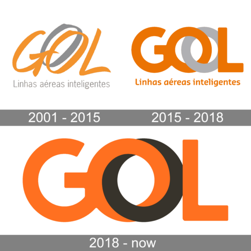
2001 – 2015

Orange has always been the main color in the GOL visual identity. For the first version, this intense shade was combined with medium gray. The composition featured a bold uppercase “GOL” lettering in orange with the gray shadow of the “O”, and a lightweight title case tagline in a modest sans-serif typeface, also in gray.
2015 – 2018

The redesign of 2015 has kept the color palette of the previous version but made orange brighter and gray — lighter. As for the style of the logo, it was refined and strengthened, with the name of the air carrier rewritten in a bold geometric sans-serif with distinctive contours. The gray “O” was intertwined with the orange one. As for the tagline, it was rewritten in orange.
2018 – now

In 2018 the GOL logo was refined again, with the gray color replaced by black. The two rings of the “O” got closer and no had no space in between. Another change was made to the tagline, which was completely removed. Also, with black, the orange in the new banner started looking more intense.


