Git is a control system software, which enables to track changes in codes and files. The program was developed in 2005 by Linus Torvalds. The software is only available in English but has its versions for various operating systems.
Meaning and history
Git, a distributed version control system, was created in 2005 by Linus Torvalds to manage the development of the Linux kernel. However, developers liked the tool so much that it became widespread and was used in other projects. Today, many projects use Git. These include PHP, jQuery, Wine, Android, Qt, Drupal, and others.
With Git, you can compare, analyze, edit, merge changes, and go back to the last save. This process is called version control.
Git stands apart from other CMSs because of its approach to working with data. Most other systems store information as a list of changes in files. Instead, Git’s approach to storage is more like a set of snapshots of a miniaturized file system. Each time you save the state of your project to Git, the system remembers what each file looks like at that moment and saves a link to that snapshot.
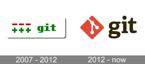
2007 – 2012
The original Git logo looked very cool, resembling the first video games, as was based on pixel-styled lettering in bright green, and an emblem, composed of three red dashes placed horizontally above three green plus symbols. It was a very geometric and strong insignia, which made the software stand out in the list of its competitors.
2012 – Today

The orange, white and black color palette of the Git visual identity is a reflection or energy and dynamics, as well as professionalism and authority.
The Git logo is minimalist and contemporary. It looks sleek and stylish with its bold smooth lines and a bright yet sophisticated color scheme.
The Git wordmark in all the lowercase lettering is executed in a classic typeface with an old-style “G” tail, which is curved and elegant.
The emblem and inscription of the Git logo are perfectly balanced and evoke a sense of a powerful and progressive brand, which also values its heritage and legacy.
Emblem

The Git logo is composed of an emblem and a wordmark on its right. The emblem is an orange rhombus with rounded corners and an abstract white image on it.
The image of the Git emblem consists of two lines with circles on its ends and at their crossing point. It looks like an atomic connection and was designed by Jason Long.
Font and color
The bold lowercase lettering from the primary logo of the GitHub software is set in a classic serif typeface with curved and thick lines. The closest fonts to the one, used in this insignia, are, probably, Adelle, Amasistrade, or Gazeta Slab with some minor modifications of the contours.
As for the color palette of the Git visual identity, it is a powerful combination of black, red, and white, where red is used in its lighter shade, which switches the accent from the emblem to the lettering, evoking a sense of professionalism and reliability.


