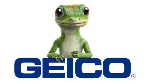
Sometimes people wonder what GEICO means. The abbreviation stands for Government Employees Insurance Company, the second largest auto insurance company in the United States. Thanks to its entertaining and humoristic commercials, the company and its logo are known not only in the US but also outside it.
Meaning and history
GEICO, or the Government Employees Insurance Company, was founded by Leo Goodwin Sr. and his wife Lillian in 1936. The company was established to provide auto insurance directly to federal government employees and their families. From these modest beginnings, GEICO has grown significantly over the decades, marked by several key achievements. Notably, in the 1950s, GEICO passed the milestone of insuring more than one million vehicles, a testament to its expanding influence and growing customer base.
The company continued to grow in the following decades, diversifying its insurance offerings and expanding its customer base beyond government employees. A pivotal moment came in the mid-1990s when GEICO began a direct-to-consumer sales model, significantly cutting costs and passing savings on to customers. This shift was accompanied by an iconic advertising campaign featuring the GEICO Gecko, which became a cultural touchstone. Today, GEICO stands as one of the largest auto insurers in the United States, known for its low-cost offerings and extensive advertising campaigns. The company’s current position is a testament to its innovative approach to insurance sales and marketing, maintaining a significant presence in the insurance industry.
What is GEICO?
GEICO is a prominent auto insurance company known for its direct-to-consumer sales approach and iconic advertising. It offers a range of insurance products and services, primarily focusing on vehicle insurance.
1936 – 1962
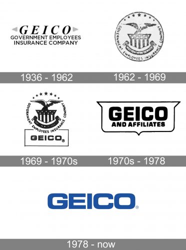
When it was established in 1936, GEICO provided the federal government members and employees as well their families with auto insurance. Now the range of the company’s clients is much wider, partly due to its GEICO symbol.
1962 – 1969
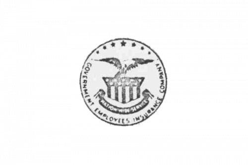
The logo, created for Geico in 1962, featured a completely different composition. A flying eagle was depicted on a rounded emblem with lettering written around the perimeter of the badge. Several five-pointed stars were set on the upper border of the circle, and the pennant with the patters of the American flag — under the bird.
1969 – 1970s
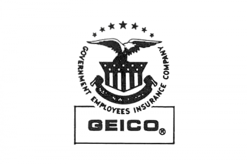
The contours of the circular emblem from 1962 were strengthened and emboldened in 1969. The badge also got accompanied by a modern sans-serif Geiko logotype in the uppercase, which was set under the medallion and outlined in a thin black rectangle.
1970s – 1978
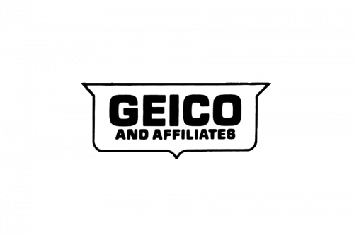
The eagle emblem was removed from the Geiko visual identity at the beginning of the 1979s. The lettering was slightly refined and the shape of the outline got more elegant contours. The new emblem stayed with the company for only a few years.
1978 – Today
The design of the company’s brand identity has always been based on the font, the color and since 1999 on the amusing GEICO Gecko, the mascot.
At first the GEICO mark simply stated “GEICO Indemnity Company Home Office: Chevy Chase, Maryland” in a serif font.
The first rebranding came in 1994, resulting in the GEICO Insurance logo that we know today ‒ the word “GEICO” written in a sans serif font. Since then the logo has appeared in several variants, but the word “GEICO” has always remained, either by itself or paired with the word “DIRECT” underneath it or with the company’s website or with the smiling GEICO Gecko.
Though the GEICO logo consists of just a wordmark (it does not always appear with the GEICO Gecko), it looks neither simplistic nor boring.
Symbol
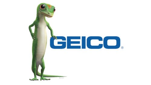
It is believed that the GEICO Gecko originated from the mispronunciation of GEICO. The Martin Agency that was in charge of the company’s brand identity took advantage of it and in 1999 there appeared commercials, ads and logos with this mascot. The company has used other mascots as well, but the GEICO Gecko is the most popular GEICO symbol.
Font
The typeface used in the GEICO Insurance logo is a sans serif designed by Aldo Novarese in 1962. The font is known by the name of Eurostile Bold Extended #2. Being simple, it inspires serious attitude and trust.
The font contrasts with the goofy commercials, creating dissociation between them and the logo, which produces a successful effect. The idea behind it is that the insurer knows how to entertain and how to do business seriously.
Color
The main color of the logo is blue against a white background. This combination is to inspire clients and make them believe that this choice will be the best, as blue is associated with confidence and stability, while white refers to purity and goodness.


