Garuda is the name an Indonesian air carrier, which was established in 1947 and today has its bases in four international airports across the country, operating the flights to more than 90 destinations around the globe. The company is owned by the government of Indonesia (60%) and is considered to be one of the most reputable in the region. of a bird, which is worshiped in Buddhism
Meaning and history
The name of the airline, Garuda, comes from Buddhism, as there is a bird-like creature with the same name, which is also called “the king of the birds”. The image of Garuda is a part of the heraldic identity in Indonesia, so the logo and naming of the air carrier is also a celebration of legacy and traditions.
1949 – 1969
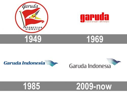
The very first logo for Garuda Indonesia was introduced in 1949 when the name of the air carrier as Garuda Indonesian Airways. The badge was composed of a red flag with a yellow image of the Garuda bird. The flag was set on a white background and enclosed into a red circular frame. As for the lettering, it was placed inside the circle, above and under the flag, and executed in an italicized custom typeface with elegant contours of the letters and smooth lines, in dark gray color.
1969 – 1985
The redesign of 1969 simplified the logo design concept of the airline to a logotype with a tagline. Now all elements were set in two levels and drawn in a bright scarlet-red color, which represented the passion and professionalism of the company. The upper level contained the “Garuda” lettering in the lowercase of an ExtraBold sans-serif typeface with rounded angles and narrowed shapes of the letters, while the “Indonesian Airways”, also in the lowercase, was set in a lightweight font with extended rounded letters.
1985 – 2009
In 1985 the name of the airline was changed to Garuda Indonesia and the new visual identity center was introduced. The color palette of the badge was changed to blue and turquoise on white, which symbolized air and freedom. Now the wordmark was set on the left from the emblem and featured a title case lettering in a bold and italicized serif font with elegant contours and thin serifs of the letters.
As for the new emblem, it was a stylized image of the Garuda Bird, which was flying to the right, and had its wings drawn in five smooth lines of different lengths and two shades of blue.
2009 – Today
The redesign of 2009 kept the emblem from the previous logo version untouched and left it in its place, but completely changed the wordmark of the Airways visual identity. The new inscription is also set in the title case but uses a straight and smooth sans-serif typeface with playful diagonal cuts of the letters. The color of the wordmark was switched from blue to dark gray, almost black.


