Fred Perry is a British brand of sport and casual fashion label, which was created in 1952 and named after a famous tennis player and one of the brand’s founders, Frederick John Perry. It became popular due to its polo t-shirts and developed in the industry as a very successful brand, combining sport and everyday fashion.
Meaning and history
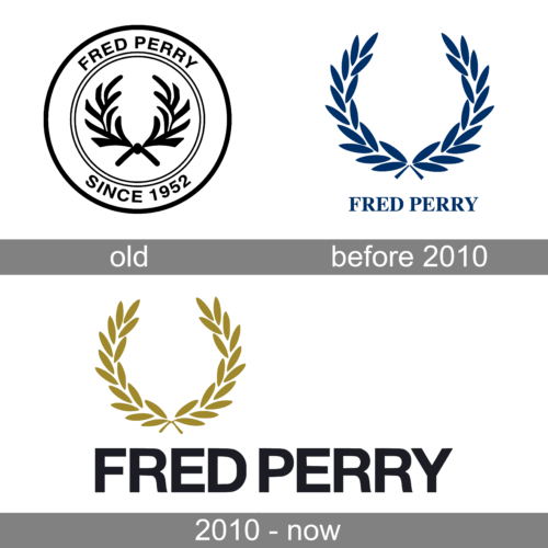
The Fred Perry logo is a reflection of one of the legendary British brand’s heritage and history. It was designed in the very first years after the company’s establishment, and hasn’t changed much by today.
The emblem of the fashion label is a laurel wreath, which performs excellence and quality, and was always associated with Wimbledon. The story says, that Fred Perry has an idea of using a pipe image for the brand’s visual identity, but his partner, Tibby Wegner, convinced him to change his mind.
The color palette of the Fred Perry logo is a royal blue on a white background. Blue evokes a sense of trust, quality and confidence, showing the power of the brand and its heritage. Making a great contrast with white, the logo reflects the brand’s authority and a perfect reputation.
1952 – ????
???? – 2010
The Fred Perry logo is composed of a wordmark, located under the brand’s famous emblem.
The wordmark in all-caps is executed in classic and traditional serif font, which is elegant and simple, yet bold and confident.
2010 – Today
The Fred Perry logo is distinguished by its iconic laurel wreath, a symbol of victory and honor, typically rendered in gold. Below the wreath, the brand name “FRED PERRY” is boldly displayed in capitalized, sans-serif letters, usually in black. This design reflects the brand’s rich heritage in British sportswear, particularly its association with tennis legend Fred Perry. The logo’s clean and timeless aesthetic makes it instantly recognizable on a variety of products, from polo shirts to sneakers.


