Foo Fighters is an American band established in Seattle, 1994. The music genre in which they generally sing is rock and its derivatives. The head of the band, responsible for guitar accompaniment and lead vocals, is Dave Grohl. He was the drummer of Nirvana in the past. The band became popular after its first album, called after its name – Foo Fighters.
Meaning and history
Initially, it was a one-man project, driven by Dave Grohl, a previous Nirvana drums player. After the disappearing of the group, he decided to make his own premier album and called it Foo Fighters. This name derived from a term, spread in US Air Force during the War, used to describe unknown flying things as well as paranormal phenomena in the sky above Eurasia and Pacific Ocean. Soon after the impressive success of his album, the popularity came to Grohl, and he had to form a collective to record more songs.
What is Foo Fighters?
Foo Fighters is an US band of rockers, founded in 1994 and originating from Seattle. The Fighters were established by Nirvana’s old participant, Dave Grohl. There are ten albums sang by the group. The band consists of Grohl, responsible for guitar accompaniment and the voice, Rami Jaffee playing synthesizer, Nate Mendel who’s caring for bass, and Chris Shiflett with Pat Smear responsible for second and third guitars.
1995 – 1997

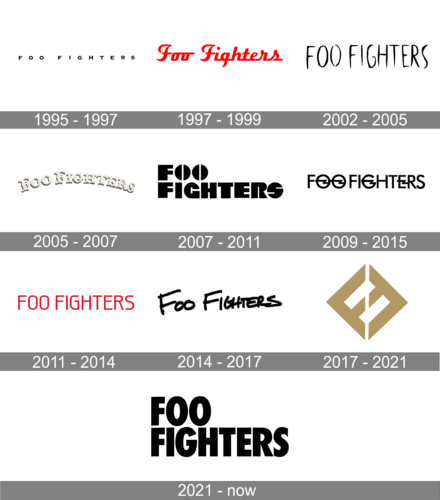
The original Foo Fighters badge was created in 1995 and stayed with the band for a couple of years. It was a pretty traditional composition with a black inscription on a white background, with the bold uppercase characters executed in a fancy serif typeface, set at a significant distance from each other, which created a very interesting pattern.
1997 – 2002
The very first logotype of the group was made for Foo Fighters’ following album, The Colour and the Shape. It was composed of a one-line inscription with the name of the band without a background. The words had a custom typeface with italicized letters, which had a red handwritten style. All letters were connected to each other by straight and abrupt lines.
2002 – 2005
The 2002 version of the wordmark appeared with the band’s fourth album, called One by One. It featured a creepy-styled typeface with extra slim letters, which had small gaps in between. All letters had an uppercase appearance, and their coloring was black.
2005 – 2007
In 2005 the logo of the band got a new style: it was an arched inscription in a fancy wishbone font, resembling the Wild West saloon style, set in a light beige shade with a brown shadow, and set against a transparent background. It was a very unusual logo for the band’s musical style, although it stayed active for two years.
2007 – 2011

The following logo was created by the brand design team of Foo Fighters band in 2007. It refers to the collective’s sixth album, which was called Echoes, Silence, Patience& Grace. As previous ones, the 2007 logo depicts the nameplate of the brand. It’s a two-line inscription without a background or any special badges, signs and other elements.
2009 – 2015

The logo from 2009 has some interesting decorative details. Those were the four horizontally-oriented lighting bolts, placed in the “O”s, the “G” and the “E” of the uppercase inscription in a modern sans-serif font, in plain black lines. And if the bolts in the “G” and the “E” were replacing the horizontal bars of the letters, in the “O”s they were just crossing the negative space.
2011 – 2014
The redesign of 2011 has introduced a bright yet simple in its geometry logotype, with the uppercase characters set in a smooth geometric sans-serif font in plain red. The contours of some letters had interesting details, which were not maybe visible at first sight, but still made the badge very recognizable and different from others.
2014 – 2017

In 2014 the name of the band was executed in a modern handwritten font with bold black lines, resembling a crayon inscription, with the contours slightly uneven. This was one of the longest-playing logos for the band, which brilliantly reflected the mood of the musicians and their style.
2017 – 2021

The redesign of 2017 was really significant, as has created the only logo for Foo Fighters, where there was not a lettering, but an emblem. It was a smooth gold rhombus, formed by two mirrored letters “F”, written in thick clean lines with diagonal cuts of the bars.
2021 – Today
In 2021 the band started using the lettering again, introducing a new badge with the two-leveled inscription in an extra-bold sans-serif typeface with straight cuts of the bars. The black inscription is set on a transparent background, looking very stable and masculine.
Font
The font of the 2007 version of the Foo Fighters’ wordmark has custom letters. For example, both ‘O’ characters are looking like circles cut in two parts by white lines. The last ‘S’ also was a circle, but with white strokes embedded inside it. The general appearance of the whole inscription consisted of extra wide lines of characters, which gave the whole wordmark a heavy style.
Color
Historically, Foo Fighters didn’t have a single brand identity. Their logotypes were always made for new albums, but not the band itself. This instability was also reflected in their color palette: the very first logotype was painted red, while the 2002 version had a black painting, and the 2007 variant was colored gray.


