 Florida International University Logo PNG
Florida International University is a publically available researchingorganization, located in Miami and established in 1965. This is the most successful university in the state, which helps its students to get a degree in more than two hundred educational programs, including business, law, medicine, mechanics, technology and others. The university has 11 colleges and multiple labs, centers and facilities spread across the globe.
Meaning and history
The story of the university derives from two senate bills. One of them came up in 1943, when Ernest ‘Cap’ Graham, a politician who worked in Florida, presented to the state assembly a proposal for the founding of a government-owned institution in Miami-Dade County. His motivation was that the growing population of the city and the state needed a place to educate and receive professional skills. However, his idea hadn’t got a support that time.
What is Florida International University?
Florida International University is a state-owned educational organization, established in Miami, 1965. This is one of the largest universities located in the United States, which provides its students with various programs referring to multiple studies in fields of human and natural sciences. There are more than 200 of these programs, lectured and examined in 11 colleges and four dozen facilities, laboratories, scientific centers, et cetera.
Then, in 1964, Robert M. Haverfield presented another bill. It instructed the state facilities responsible for education to plan the construction and organization of the new state university. A year later, the bill was signed and became a law, establishing Florida University. It was turned into international In 1970s, when Harold Crosby, the second leader of the institution, introduced new educational programs with multinational direction. He also managed a faculty enrollment of Latin and Caribbean American students.
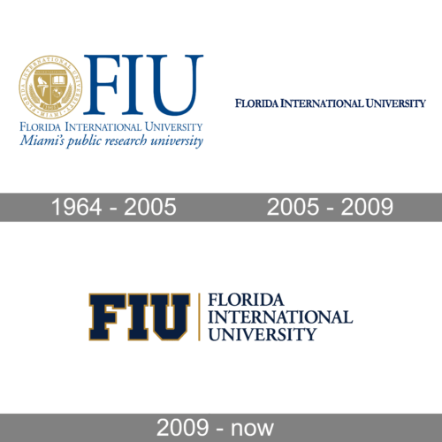
1964 – 2005
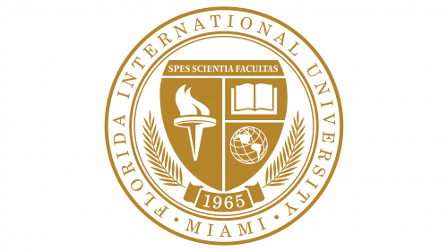
It’s a sophisticated emblem that conveys the institution’s heritage and commitment to academic excellence. Central to the design is a circular seal rendered in a dignified gold tone, reminiscent of the classic seals of historic educational institutions. The seal is adorned with various symbols: an open book representing knowledge, a globe signifying the university’s international reach, and a torch symbolizing enlightenment and learning. Around the perimeter, the university’s name and founding year, 1965, are proudly displayed. Encircling this are two laurel branches, which traditionally denote honor and victory, further emphasizing the university’s pursuit of high achievement.
2005 – 2009
The first logo portrays the name “FLORIDA INTERNATIONAL UNIVERSITY” in a strong, elongated serif typeface. The characters are in a deep navy blue, which suggests a sense of tradition and stability, qualities befitting an institution of higher learning. The text is set against a plain white background, which allows the rich color and detail of the lettering to stand out, ensuring legibility and a formal appearance. The serif font, with its small lines or strokes at the end of larger strokes in each letter, adds a classic academic touch to the logo, reflecting the history and the seriousness of the educational pursuits at the university. The overall simplicity of this design emphasizes the institution’s focus on substance and academic excellence over stylistic embellishments.
2009 – today
The logo is a more contemporary representation of Florida International University. It features the acronym “FIU” in large, bold serif letters with a gold outline, which adds a touch of prestige and is evocative of the university’s excellence. The letters are filled with a deep navy blue, maintaining the institution’s traditional color scheme. To the right of the acronym, a vertical gold line creates a visual separation, leading to the full name of the university in a smaller, simpler sans-serif font, also in navy blue. This combination of serif for the acronym and sans-serif for the full name presents a balance between the university’s storied tradition and its modern, forward-thinking ethos. This logo encapsulates a blend of historical pride and contemporary clarity, symbolizing FIU’s dedication to remaining relevant in the ever-evolving educational landscape.
Seal
The first mark of the university is its circular seal, which is used for documents only. It consists of two parts: the outer ring and the inner part containing the shield with institution’s symbols. The ring depicts the inscription with the name of the university and its address. This area of the logo is bordered by lines from the outside. Deeper in the logo, we can see two ornamental sticks with leaves and a stylized line with the year of foundation on it.
Above it all, there is a large shield, cut into four parts, each of which showed its own element. The upper trapeze depicted the motto in Latin – ‘Spes Scientia Facultas’, or ‘Hope, Science, Opportunity’ in English. The left half of the shield is the most prominent. It depicts a torchlight, supposed to reflect the fire and light of Knowledge. In the lower right corner of the shield, there is a part with a globe, featuring the ‘International’ word. Above it, a sector with a book is located.
Font
Both the seal and the primary logotype feature the name of the university in the same typeface. It has prominent yet thin serifs and somewhat bold general bars of each letter. In fact, this is a typical elegant script with large serifs. The only difference between two versions of the name is the space between letters. The seal depicts wording with the letters spread far from one another, while the logotype depict a more narrowed inscription.
Color
The FIU brand design team has decided to use two different color schemes. All of the main elements of the seal, including lines, ornaments, shield, and the name, are colored golden. The motto, year of foundation and the symbols on the shield have rather a black painting. The logotype, however, depicts deep blue acronym, contoured bright golden yellow and bordered by a line of the same yellow colored. The full name of the university has the same deep blue painting.


