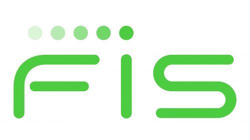
The largest processing and payments company in the world, FIS is headquartered in Jacksonville, Florida. It designs and sells financial software, services, and business solutions to a global clientele. The number of employees is over 55,000, and they come from over 50 countries. As of 2021, it was ranked #241 on the Fortune 500 list.
Meaning and history
The simplicity of the FIS logo is deceptive – this minimalist design seems to be the result of hard work carried out with attention to detail.
What is FIS
FIS (Fidelity National Information Services) is an American company specializing in financial products and services. It has been best known for its FinTech project working primarily in three spheres: Merchant Solutions, Banking Solutions, and Capital Market Solutions.
1968 – 2003 – Systematics
The company was established in 1968 under the name of Systematics. It later changed hands becoming the property of ALLTEL Information Services. The brand’s earliest logotypes reflected its original name.
It was only in 2003 that the company was purchased by Fidelity National Financial and changed its name to Fidelity Information Services (FIS).
2004 – 2014
The logotype trademarked in 2004 looked utterly different from the current vibrant and sleek version. However, it also was based on the lettering “FIS” set in large uppercase letters. In the original logo, the wordmark was placed inside a rectangle with rounded corners. The rectangle also housed two small arrowheads, which were placed to the right of the wordmark. The arrowheads and the rounded corners made the rectangle look like a button. This made the logo more interactive and eye-catching.
In addition to the abbreviation, the full name of the company was also featured in the old logo. It read “Fidelity National Information Services” and was placed below the “button”. The letters were rather small, which damaged their legibility at smaller sizes.
2014 – present
While the old FIS logo was good enough, the updated version seems far more effective. It manages to leave a more perceptible impact despite using a smaller number of elements. Due to its laconic style, it is easier to grasp and remember, which is also an essential feature of a successful design.
The design includes only the three letters of the company name and a set of dots above. The size and overall proportions are similar to the previous logo, but there are many new details making this font stand out. The top angle on the “F” has been rounded, while the turns of the “S” have been made slightly rectangular. As a result, the “F” and “S” are formed by lines of similar shape, which makes the glyphs “rhyme”.
The lower bar in the “F” has the same shape as the “I”, only it has been rotated 90 degrees. This contributes to the visual rhyme. The ends of all the letters are rounded, and the thickness of the glyphs is the same throughout the wordmark.
The five dots over the lettering have the same shape but vary by the intensity of the color. The final dot on the right, which is positioned above the “i”, is the brightest one, while every following dot is a bit lighter. As a result, it seems that the wordmark is moving, the lighter dots being the traces. This is a rather unusual (and thus memorable) way of adding a dynamic touch to a logo.
Colors and font
The color is similar to grass green but its vibrant accent makes it close to neon. It isn’t a generic choice, so it helps to make the FIS logo distinctive.
While the type is perfectly legible, it also makes a substantial contribution to the dynamic style of the design. The letters merge perfectly as they are based on the same shapes.


