Esprit is a fashion brand of clothing and accessories manufacturer, which was founded in 1963 in California. Today the brand is headquartered in China and Germany and has more than 400 retail stores worldwide.
Meaning and history

The famous Esprit logo was designed in 1968 by John Casado, and it still remains the same, except several color palette modifications held during the brand’s history.
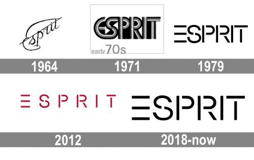
1964 – 1971

Before adopting iconic Casado’s design, the brand used a cursive wordmark. Here, the word “Esprit” was positioned diagonally, it featured a prominent “E” with extended ends. There was also a distinctive diagonal line going along the top parts of the letters.
1971 – 1979

A totally new version was introduced. Here, a heavy sans serif font was used. The letters were formed by a combination of white, black, and grey lines.
1979 – 2012

The era of Casado’s logo started. Originally, it was black.
2012 – 2018

For a comparatively short period, the company used a red version of the same wordmark as its main logo. Here, there was more breathing space between the letters.
2018 – Today

The Esprit logo is composed of a wordmark in a custom signature typeface. The font used for the nameplate is close to Tigra. The “E” of the wordmark is drawn as three parallel horizontal bars, without a vertical one, which makes the logo light and modern, it adds more air and light to the whole composition. The lightweight “E” is balanced with the intense “Sprit” part, which is strong and bold.
The two most common color schemes of the Esprit visual identity is red and black. Red has been the main color of the company for many years, used in label’s packaging and stores interior design. It is a symbol of passion and energy, which are the main characteristics of this dynamic and progressive brand.


