 EDF (Électricité de France) Logo PNG
The abbreviation “EDF” refer to the French electric utility company Électricité de France S.A. or to its British subsidiary EDF Energy. The parent company is largely owned by the state and is headquartered in Paris. The subsidiary is based in London, England, United Kingdom. The company was founded on 8 April 1946 following the nationalization of over 1,650 minor companies operating in energy production, transport, and distribution.
Meaning and history
The EDF logo has gone through over five updates until it got the memorable and vivid look it has today.
What is EDF
EDF is short for “Électricité de France,” which means “Electricity of France”. It is a multinational electric utility company with a revenue of €71.3 billion (2019). As of the fall of 2021, 83,77% of the company belongs to the French state.
1946 – 1972
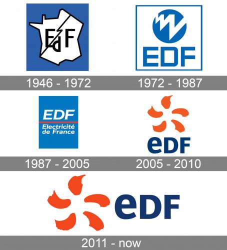
The original logo can be seen as a symbolic representation of the brand’s name. There is a stylized map of France with a black lightning bolt going through it. The map represented France, while the lightning bolt was used as a universal symbol of energy and electricity.
There was also the abbreviated name of the brand. Interestingly, the letters “E” and “F” were capitalized, while the “d” was lowercased. This was supposed to show that the “d” was the initial of a preposition, so it carried less meaning.
However, in the next logo, the company already gave up this approach.
1972 – 1987
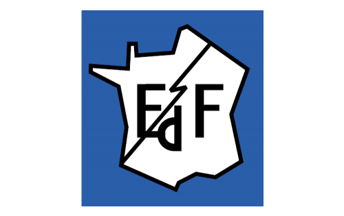
This time, all the letters were capitalized. This was one of the reasons why the logo became better legible. The new shape of the glyphs also contributed to the enhanced legibility. The glyphs became bolder and wider. On the downside, the “D” looked too much like the “O”.
The symbol of electricity was still there, but it was redrawn, too. It was bolder, and its shape wasn’t the generic lightning bolt but a dynamic zigzag. There was even some depth in it – the zigzag seemed to be moving forward from the distance.
The map disappeared. On the one hand, it meant that the “France” theme was no longer featured in the logo. On the other hand, this made the design by far simpler.
1987 – 2005
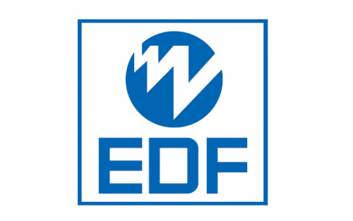
The “electricity” emblem disappeared from the EDF logo leaving only the wordmark.
This time, the logo was a blue rectangle broken down into two fields by a red horizontal line. The line was positioned almost exactly in the middle of the rectangle.
The top field housed the abbreviation “EDF”. The type was still highly legible but looked different. It was italicized, and some of the ends were now diagonal. As a result, the wordmark looked more dynamic.
In the lower field, the full name of the company was placed. It was set in smaller letters and combined capitals with lowercase glyphs.
2005 – 2010
This time, the redesign was a huge leap ahead. Eventually, this visual brand identity looked like a real logo.
The unexpected casual strokes alluded to the “energy” theme due to their color. They looked dynamic. Moreover, they somehow resembled a living being, maybe even a human being. The top stroke was the head, the two strokes in the middle were the hands, while the lowest strokes were the legs. The figure looked as if it was walking.
The wordmark could be seen below.
2011 – present
The only notable modification was that the wordmark moved to the right of the logo.
Colors and font
The orange seems one of the most obvious colors symbolizing energy. The blue used in the wordmark was apparently chosen because blue shades are direct contrasts to orange. Also, it is a rather business-like color, so it kept the design more serious.
The type on the EDF logo may seem quite generic. And yet, the fact that it combines a lowercase “e” with two capital letters adds a unique touch.


