Ed Sheeran is a British pop singer and songwriter, who was born in 1991 in Yorkshire and became popular in the 2010s. By today Ed Sheeran has released four albums and sold almost 160 million copies across the globe. Sheeran is one of the most awarded you g singers.
Meaning and history
Ed Sheeran is the new world pop-star, known for his romantic songs and velvet voice. He is known as the singer, concentrated first of all on his music, so his visual identity design history is pretty short.
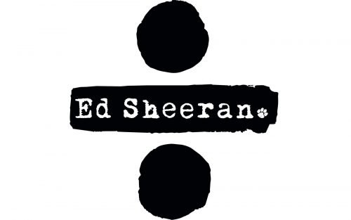
The only official logo for Ed Sheeran was designed in 1011 and is still used by the singer.
The black inscription on a white background is complemented by a small and delicate graphical element, which is very cute and playful. The dog’s paw replaces the dot after the singer’s name. It is a symbol of loyalty and friendship, which represents Ed Sheeran first of all as a person with a big kind heart.
The logotype in the title case is written in a custom serif typeface, which is very close to Fletcher Typewriter or Linotype Typo American Pro Regular fonts, which look stylish and unusual for the music industry.
The monochrome color palette of the Ed Sheeran logo allows placing it on any possible background and surface, as it brilliantly balances the typewriter-style of the inscription, evoking romantic and vintage feelings and emotions.
The singer made a perfect choice for his visual identity, as it characterized him as a person with an amazing soul, the one who definitely feels and knows all he sings and writes about.
Symbol
The dog’s paw became one of the most recognizable graphical symbols in the world’s music industry. It is now an inevitable part of all the fan art and is usually drawn in a contrasting color — like red or orange, replacing “heart” symbols on posters and fashion items.


