Durex is a British condoms brand, founded in 1915 and originally developed and produced in the United Kingdom by SSL International. SSL International was sold to the company Reckitt Benckiser in 2010. It is one of the best-selling condom brands across the world, with 30% of the global market.
Meaning and history
Durex is a brand used for various products around the world but is known primarily as the brand of condoms.The name was licensed in 1929 by The London Rubber Company and it is an acronym for “DUrability, Reliability, and EXcellence”.
What is Durex?
Durex is a brand name for barrier contraceptives and related safe sex products manufactured by Reckitt Benkiser since 2010(until 2010 the brand was owned by the British SSL International). The name comes from “Durability, Reliability, and Excellence”.
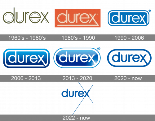
1960s – 1980s
The first Durex logo depicted their name written in thin lowercase letters of a rather plain sans-serif font. There were also thin lines drawn alongside the characters’ edges in many places and at some distance from them. Usually, they’d put it onto the grey or white background.
1980s – 1990
In this next design, the colors were the only big change. The logo now had a rectangular orange background with white letters on it. There was also now a line sprouting from the bottom of the letter ‘X’ and going all the way to the front letter.
1990 – 2006
The 1990 logo uses all the same features, despite the visible difference. The background turned bright blue, and the corners of the rectangular foundation were rounded. The letters grew bolder and got rid of the thin lines along their edges. The bottom line also follows the borders of the rectangle all the way around (on the inside, of course).
2006 – 2013
In the 2006 version, the letters turned to a more fluid style with fewer square corners. Moreover, there’s also now a big shade coming from the bottom of the logo.
2013 – 2020
The Durex logo 2013 is a rectangle with rounded corners, framed in white and blue with a white wordmark in custom typeface on a blue background.
2020 – Today
The brand uses common for the industry color palette, which send a truth worthy message to its customers. Blue is a symbol of reliability, strength and tranquility, while white details add a sense of purity.
The Durex logo is highly recognizable due to its wordmark. The closest available font to the Durex typeface is Century Gothic Font.
2022 – Today
In 2022 the Durex logo was redesigned again, keeping the iconic style and color palette, yet simplifying the structure and making the composition more laconic and stylish. The softened typeface from the previous version remained the same, with just the lowercase “X” being rewritten. The previous badge had the diagonal bar of the “X” elongated to the bottom right corner, while the new version boasts an elongated right bar, pointing upright. The lines of the letter also got thin blue lines coming out of the bars of the “X” in four directions.
Font and color
The stylized lowercase logotype from the primary Durex badge is set in a fancy modern sans-serif typeface with some unique designer details. The closest font to the one, used for the Durex insignia is, probably, Shadeerah Regular, but the contours also repeated a simpler type, Korto Medium.
As for the color palette of the Durex visual identity, it is based on a calm and pleasant shade of blue, a color, which evokes a drawn of protection and reliability, showing the brand as a professional and trustworthy one, and making the customers confident in its products.


