Dollar General is the name of the retail company from the United States which was established in 1939 in Kentucky. Today the company has more than 16 thousand stores across America and offers low-cost clothing, home decoration items, houseware, and grocery goods.
Meaning and history
The visual identity of the famous variety retailer has always been consistent — the text-based logo executed in a bright and juicy color palette hasn’t changed much throughout the years, and is instantly recognizable not only across the United States but everywhere in the world.
1955 – 1972
The very first logo for the company was designed in the 1950s and consisted of a bold logotype in black, placed on a yellow rectangular background. The style of the lettering was unique and in today’s logo of the retailer all the most recognizable features of the original concept are still kept.
In the original logo, the “Dollar” part of the wordmark was the main. Written in a bold sans-serif with the thick straight lines, the inscription has the tails of “Dl and “R” elongated. Under “Dollar” the “General Stores” lettering in all capital was placed. It was written with the use of the same font but in thinner and more delicate lines.
1966
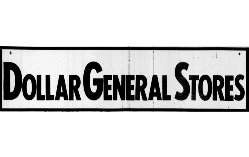
The original badge for Dollar General was created in 1966 and only stayed with the retailer for a few months. It was a simple yet stable and solid uppercase inscription in sans-serif with all the first letters enlarged and emboldened. The black lettering was set in the light background and enclosed into a horizontally oriented rectangular frame, also black.
1966 – 1967
A little later in the same year, the logo was redesigned for the first time. Now the lettering was set in white on a black background and all the symbols featured the same size. The lines of the letters became thicker and the contours — more modern and strong. It was a confident and powerful text-based logo, which o key stayed with Dollar General Stores for less than a year.
1967 – 1972
The redesign of 1967 refined the contours of the white lettering and switched its color to light gray, which made the contrast weaker and the overall composition more elegant and calm. In general, not much changed in style and mood of the Dollar General Stores visual identity.
1972 – 1984

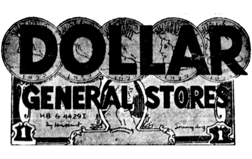
The redesign of 1972 changed the concept of the retailer’s visual identity. The new badge featured an enlarged “Dollar” logotype in a modern custom typeface with a small yet visible and memorable element on the left side of the letter “D”. The inscription was placed above the “General Stores” lettering set in one line, and written in a geometric sans-serif typeface, with interesting contours of some letters. The whole badge was drawn in black and set on a white background.
1984 – 1995
In 1984 the font of both logo parts remained untouched but the composition got some changes. Now the “Dollar” wordmark was set on the right from the “General Stores” written in two levels in smaller letters. The whole inscription was set on a bright yellow background and enclosed into a horizontally stretched black rectangular frame with rounded angles. This logo stayed with the company for almost a decade.
1995 – 2009
The name of the retailer was shortened to just “Dollar General” and the logo was redesigned in 1995. It was still black lettering on a bright yellow background, with a thin black frame, but now the “General” part was executed in the same style and size as the “Dollar” one, which made the whole badge look more powerful and solid.
2009 – Today
The redesign of 2009 brought a more modern and sleek style to the company’s logo. The yellow and black color palette, which reflects energy and professionalism, is still with the brand, though the rectangle was changed to a smoother figure, as well as the inscription gained a more refined contemporary look.
The Dollar General text-based visual identity is simple yet memorable and recognizable. It is strong, bright, and eye-catching, showing the company’s dynamics and power, and their attitude to their customers, as the main value.


