 Diners Club International Logo PNG
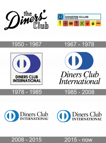
Although the logo of Diners Club International (DCI) has been updated at least four times, the “DC” symbol has been present on it, in one form or another, during most of its history.
Meaning and history
Diners Club International is the world’s first financial organization, which started working with credit cards. The company was established in 1950 by Frank McNamara. Diners Club International’s first marketing move was to give away 200 charge cards for free. At the time, no one would have guessed that in less than half a century the company would be one of the 75 Greatest Business Solutions in history.
The first 200 credit cards, issued by the company, were given to employees of firms whose offices were located next door, all in the same Empire State Building. The card was issued free of charge, and the person wishing to get it had only to work in the same building. The first payment card in the world was a small cardboard plate with an embossed number that was given to each client.
Cardholders could get lunch on credit at any of the 14 closest restaurants. The customer presented his card to the restaurant owner and after lunch, he signed the bill, Diners Club paid the bill to the restaurant owner, and sometime later the customer settled his debt by paying directly to the company. Those were the first credit payments by card in history.
1950 – 1967
The original Diners Club International logo was a pretty refined one. The handwritten script used for the word “Diner’s” was elegant yet not perfectly legible. The words “the” and “club” featured a simple type, which also had a subtle legibility issue due to its structure.
1967 – 1978
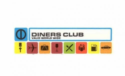
The design was completely redrawn. The name of the brand was now given in an austere sans serif type inside a white rectangle with blue trim. The rectangle was surrounded by various icons showing the products and services available.
It was on the 1967 logo that the “DC” symbol appeared for the first time. The symbol depicted the two letters in the form of a circle with a vertical bar going through its center.
1978 – 1985
The first version of the Diners Club International logo we all can see today was introduced in 1978 and stayed unchanged for almost seven years. The abstract white “DC” monogram, inscribed into a circle, was outlined in dark blue and shadowed in the shade hue. The emblem was placed above the two-leveled black uppercase inscription in a bold sans-serif typeface and enclosed into a thin dark-blue square frame.
1985 – 2008
The “DC” symbol now dominated the design. This time, it was placed inside a dark blue ellipse. It was not at the center of the ellipse but moved to its left side.
The name of the company could be seen below. The type was somewhat reminiscent of a handwritten script, although the letters did not look casual and were legible enough.
2008 – 2015
The ellipse grew somewhat shorter in comparison with the “DC” symbol, so the blue space was reduced. The writing moved to the right of the emblem. The type was not italicized anymore and it looked simpler.
2015 – Present
The design was slightly refreshed, although its overall look has remained unchanged.
Font
Both the lines of the Diners Club International logo feature a classic and elegant serif type. In the first line, only the initials are capitalized, while the second line is made up of only capital letters.
Company overview
The history of Diners Club International started in 1950. It is the first independent payment card company in the world. Today, it is one of the world’s best-known charge card companies. The company and its franchisees operate in more than 55 countries.


