Deportivo La Coruña is the name of a professional football club from the north of Spain, which was established in 1906. The club is based in the capital of Galicia province, A Coruña, and has Riazor as its home stadium.
Meaning and history
Deportivo La Coruña belongs to Division I of the Spanish RFEF league, which is on the third step of the football hierarchy in the country. Dépor (the shortened name of the club), known for their bright white and blue uniforms, is one of the oldest clubs in its province, and their games always gain a lot of people on the Riazor Stadium.
What is Deportivo La Coruña?
Deportivo La Coruña is a Spanish professional football club, which was founded at the beginning of the 20th century in Galicia. The club with the full name Real Club Deportivo de La Coruña has several nicknames, including Los Herculinos, in the honor of the oldest extant lighthouse in the world, which is located near A Coruña.
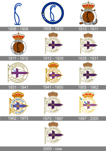
In terms of visual identity, the Galician football club has seen many redesigns, but most of them were just refinements of the badge, designed for Deportivo La Coruña in 1912.
1906 — 1908
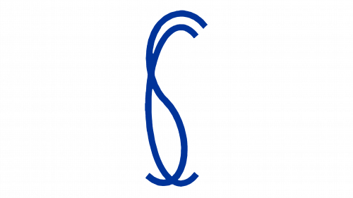
The very first logo, created for Depor in 1906, featured a laconic bright blue monogram with two intertwined narrow letters, “S” and “C”, which stood for the “Sala Calvet” the name of the gymnasium where the club was founded. The initials were set on a plain background and had no additional details, and like this, the logo existed for almost two years.
1908 — 1910
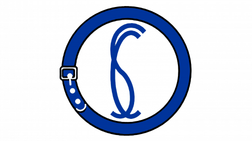
The redesign of 1908 placed the “SC” monogram on a circular medallion with a bold blue framing, which was stylized as a fattened belt, with a silver buckle and three white dots on its left part. Although the composition of the logo was quite minimalistic, this naive stylization made it unique and memorable. The badge stayed as a primary one for another two years.
1910 — 1911
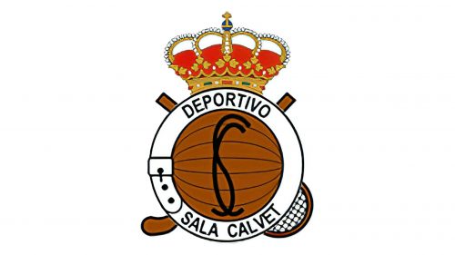
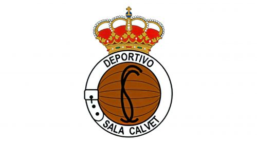
In 1910 the new logo was introduced to celebrate the King Alfonso XIII patronage of the club, so some “royal” details were added to the emblem, along with the new color palette and a full inscription. The new badge featured a brown ball, outlined in a white belt-frame with the black “Deportivo Sala Calvet” in the uppercase. The SC monogram was now written in black, over the brown background. The circular medallion was placed over a crossed hockey stick and tennis rocket and had a red and yellow crown set on top of it.
1911 — 1912
The redesign of 1911 cleaned up the contours of the club’s logo and removed the crossed wooden stick and rocket from the background, keeping only the circular medallion and the crown. As for the lettering on the frame, and the monogram, they remained untouched.
1912 — 1928
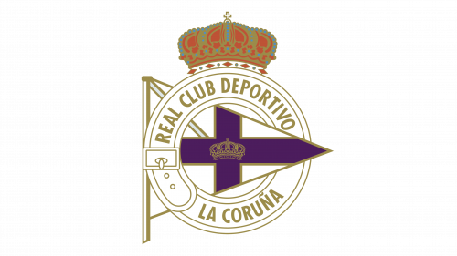
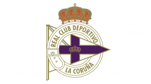
The prototype of the logo, which became iconic by today, was created for the football club in 1912 and stayed untouched for almost 16 years. It was a circular belt-frame from the previous versions, which was widened and redrawn in white with a double gold outline and a new gold inscription “Real Club Deportivo La Coruña” written around its perimeter. The triangular flag in the same color palette with a heavy purple cross on it was placed behind the circle, on its left, with the triangle coming through the frame. That was the official flag of Galicia. The delicate golden crown in the center of the cross was complementing the large red and gold one on top of the circle.
1928 — 1931
In 1928 the logo of the football club was slightly refined, with the main crown in red and gold getting a bit smaller, which gave the badge a more balanced and harmonized look. All other elements remained untouched.
1931 — 1941
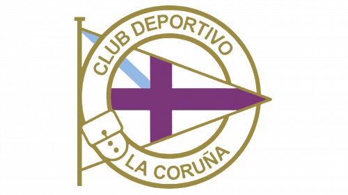
The Alfonso XIII regime has fallen and all depictions of royal paraphernalia became illegal, so the club had to remove both crowns from its logo. The designers decided to redraw the badge in a bolder and more modern manner, replacing the double golden line with single bold ones, removing the outline of the purple cross, and adding a light-blue diagonal stripe instead of gold and white on the triangular flag. The shade of purple was lightened up, and the lettering on the frame became heavier and wider.
1941 — 1955
As soon as it became possible to put the crowns back on the logo, the football club took the opportunity, and in 1941 returned to its logo with two crowns, slightly changing its color scheme. The shade of gold gained more yellow shades, which made the whole composition look brighter and more delightful. The upper crown was larger than on the previous versions and had more gold details than ever before. As for the smaller crown, the new badge, it was executed in a gold and red palette. The diagonal blue stripe was removed from the flag.
1955 — 1962
The redesign of 1955 brought back the elegant double outline and thinner lines of the crowns and lettering, and returned the diagonal line to the triangular flag, drawing it in the super-light shade of blue, and outlining it in gold again. The purple cross got back its old dark and deep shade, which looked more royal and sleek, and the gold of the Depor logo got lighter again, so actually, the club returned to its logo from 1928.
1962 — 1973
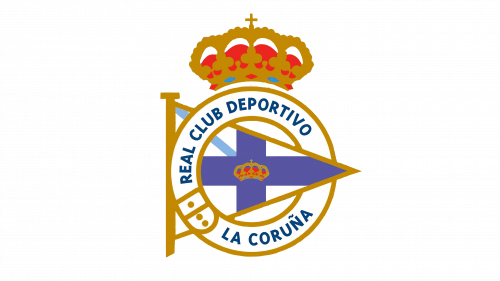
The modernized version of the Deportivo La Coruña Football club was introduced in 1962. The color palette was changed from purple to blue, with the gold lettering getting blue as well, and the diagonal line getting more visible and having its outline removed. All framing became thick, instead of double thin lines, and the crown on top of the badge became more massive and heavy.
1973 — 1997
The badge, used by the club in the 1950s was brought back in 1973 and stayed unchanged until the beginning of the 1990s. That was a classic Depor logo in light gold and dark purple palette with a small contoured crown in the center of the cross and a barely-colored diagonal stripe on the flag.
1997 — 2000
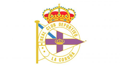
The brightest version of all was designed for the Galician football club in 1997. Gold elements were replaced by yellow, and the red of the crown got an intense scarlet shade, while the purple cross became lighter and more tender. The light blue diagonal line of the flag turned medium-blue, and the golden parts of the grown got decorated by the turquoise gems to balance the line.
2000 — Today
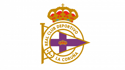
In 2000 the club returns to its most often used badge, in light gold and purple color palette, with double outlines and a delicate contoured crown on the cross. This is the most elegant and timeless emblem design, which has become truly iconic by today.


