The logo of Crédit Agricole seems to have been inspired by the nickname “Green Bank.”
Meaning and history
Credit Agricole Bank is a modern universal bank, one of the most reliable and stable in Europe. It is part of the French financial group Credit Agricole and is one of the largest banks in France and the world.
The history of the financial company began in 1894 when a French government decree was issued that gave the right to create local banks CREDIT AGRICOLE to members of farmers’ unions. Such banks were the property of the members and their operation was based on the principles of mutual aid.
Today Credit Agricole Bank provides a full range of banking services both to corporate clients and individuals. In particular, the bank pays special attention to cooperation with companies inthe agro-industrial complex.
What is Credit Agricole?
Credit Agricole is the name of the tenth largest bank in the world, which was established in France in 1894. Today Credit Agricole is one of the most reputable banks in France and is the second-largest after BNP Paribas. The bank offers its customers a full range of financial services.
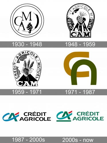
1930 – 1948

The 1930 logo was a round shape with several elements in its core, including the letters C, A & M, the wheat ear and some grapes. These were then encircled by a bold frame. Everything on the logo was black or white.
1948 – 1959
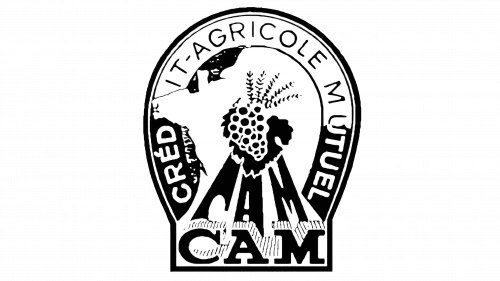
In 1948, they updated the logo into one shaped more like a light bulb. In its central, there were grapes and some wheat put right in the center of a sprawling white map of France. The products cast shadows shaped like the three letters from ‘CAM’. The acronym itself was written directly below these shadows in a nook in the bottom of the logo.
The frames of the upper section held the words ‘Credit Agricole Mutuel’ in black and white letters.
1959 – 1971

The 1959 logo is the same design, except they made everything more detailed, including the map, the products and the letters. They also introduced system and sense of uniformity to this design. The cabbage was added to the center, and the shadows lost their shapes. Color-wise, the main acronym and the frame became white. The letters of the full name became black, and the products used both.
1971 – 1987

The 1971 logo used two horseshoe shapes colored ocher and weed-green. They were arranged into the letters ‘C’ & ‘A’ one next to the other.
1987 – 2000s

This design mostly uses the elements as seen in their next design. The only difference here is that the letters in the wordmark are black instead of green, and there is no additional line below the emblem.
2000s – Today
The current Credit Agricole logo is the combination of the initials of the bank’s name. The letters are positioned in such a way that the longer end of the “C” forms the horizontal bar of the “A.” Moreover, the end of the “C” is extended so much it had to be “cut” so as not to “grow” beyond the borders of the logo.
This “growing” design and the greenish palette help to remind of the historical ties to farming Credit Agricole has. We should also point out that it has been often referred to as “La banque verte”, which means “The green bank” in translation from French.
Although the emblem looks dynamic and has a “farming” note, it is impossible to guess to which company it belongs unless you already know it. That’s why you can often see the “CA” emblem paired with the writing “Crédit Agricole” or “Group Crédit Agricole.”
The logo of the Group is typically given in white over the dark green background, while the logo of the bank itself features two shades of green with a red accent.
Font and Color
The bold and elegant uppercase lettering from the primary badge of Credit Agricole is set in a sleek and sharp sans-serif typeface with some unique details, which make the inscription look individual and recognizable. The closest fonts to the one, used in this insignia, are, probably, Saint Regus Medium Expanded, or Aviano Gothic Heavy, but with some interesting modifications of the contours.
As for the color palette of Credit Agricole’s visual identity, it is based on a combination of grass green, sea green, and bright red. All the elements are placed against a plain white background, which creates an amazing contrast, making up a lively vivid image, evoking a sense of motion and progressiveness.
The type featured in the Group Credit Agricole logo is a clean, minimalist sans. While the majority of the letters look perfectly average, the “E’s” have an unusual touch: their top left corner is a straight angle, while the lower angle is rounded.
Company overview
Crédit Agricole Group is ranked as the largest cooperative financial institution in the world. The group comprises a network of local banks and around 40 regional banks, while the central institute is the Crédit Agricole S.A.
The bank was established in 1894. It is headquartered in Montrouge, France.


