Coppin State Eagles Are the name of an athletic program from Coppin State University, which was established in 1900, and is based in Baltimore, Maryland. The program is composed of 14 men’s and women’s teams, which compete in the first division of the National Collegiate Athletic Association.
Meaning and history
Coppin State Eagles has all of its teams competing in Division I of the National Collegiate Athletic Association, and they are also members of the Mod-Eastern Athletic Conference, which is a sports organization, affiliated with the first division of NCAA, and created in 1970 as a conference for black colleges and universities.
What are Coppin State Eagles?
Coppin State Eagles are the collegiate athletic program of Coppin State University, which consists of six Jen’s and eight women’s teams, competing in various sports disciplines, including indoor and outdoor Track & Field, Cross Country, Baseball, Basketball, and a few others.
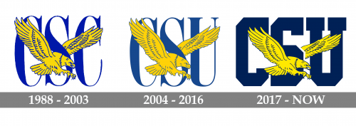
In terms of visual identity, the Eagles from the Coppin State University in Maryland have been very consistent and loyal to its original badge with the program’s mascot and delicate yet strong lettering behind it. The color palette of the Coppin State Eagles hasn’t changed much throughout the years either.
1988 — 2003
The Coppin State Eagles logo, designed in 1988, featured a bright blue and yellow composition with the yellow in blue outline placed on a background with the elegant serif “CSC” (Coppin State College during those years) abbreviation, written in blue capitals. The bird was drawn facing to the right and with its wings spread up. It was a lively and memorable badge, which at the same time looked pretty simple, evoking a sense of stability and confidence.
2004 — 2016
The redesign of 2004 changed the “CSC” lettering to “CSU”, as the college for the University status, and had its color palette refreshed; with both blue and yellow shades getting calmer and slightly darker. The new muted color palette and the refined cleaned contours of all elements made the badge look stronger and more professional. As for the lettering, the typeface remained I’m the same, and the bird on the emblem also repeated the silhouette and style of the previous version but had its outline and details drawn in thinner lines.
2017 — Today
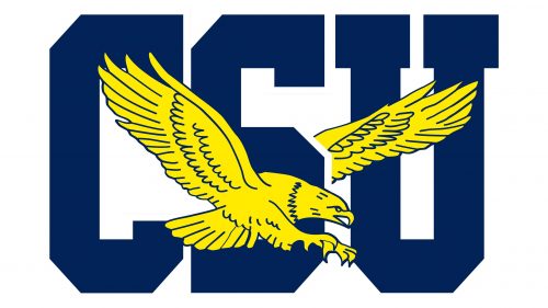
In 2017 the Coppin State Eagles logo got redesigned again, and this time the image got stronger and more stable. The main change of the year was in the replacement of the elegant narrowed font from the previous badge with the new massive and square serif typeface. The extra-bold letters of the “CSU” abbreviation were also executed in a darker shade of blue, while the yellow of the eagle became lighter, creating a strong contrast between the elements.


