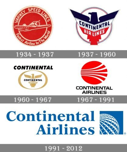
Now-defunct Continental Airlines went through five logotypes. The reasons for an update were different, from the desire to look more patriotic or modern to the need for distancing itself from the negative past.
Meaning and history

Continental Airlines was once one of the five largest airlines in America, the company was founded in 1934. The route network covered almost all continents, with over three thousand flights daily. During different periods of its existence, Continental Airlines was a member of SkyTeam and Star Alliance.
The history of Continental Airlines began on July 15, 1934, with the founding of the small Varney Speed Lines airline. Its first destinations were major cities in neighboring states. In 1937 the company became Continental and moved its headquarters to Denver Airport.
On October 1, 2010, Continental Airlines and United Airlines merged. The resulting air carrier was named the second company. And in 2012, the airline ceased to exist completely.
What is Continental Airlines?
Continental Airlines is the name of a former American air carrier, which was established in the middle of the 1930s, and merged into United Airlines in 2010. Two years after the merger the company ceased all operations.
1934
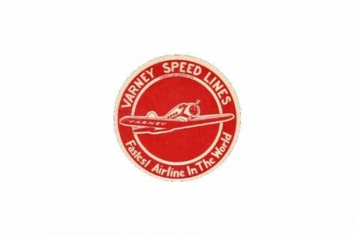
The company was established in 1934 as Varney Speed Lines (named after one of its initial owners, Walter T. Varney). The original Continental Airlines logo was a red roundel with an outline of an aircraft in white in the middle. The aircraft was encircled by the lettering “Varney Speed Lines” (above) and “Fastest Airline in the World” (below). The lettering was placed in between two rings.
Both the aircraft emblem and the writing were given in white.
1937
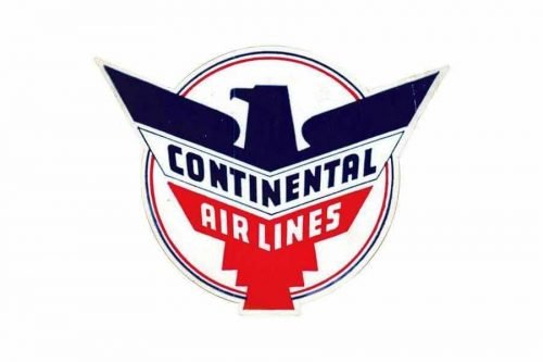
The new design alluded to the national symbols of the US, including the eagle and colors of the flag. By using the eagle, the design forces behind the brand combined the national symbol with the bird as a symbol of aviation. While the circle remained, it was now white with thin blue, red, and gray trim.
The typography grew better legible.
1960
The Continental Airlines logo was dominated by gold and white with black accents. The eagle became smaller – it was now housed inside an ellipse symbolizing the globe. The word “Continental” became more prominent – it grew larger and was now placed above “the globe.”
Strangely, the lettering “Continental” was used for the second time inside the ellipse. Here, it was smaller and was paired with the word “Airlines.”
1967 – 1968
The new logo was created by graphic designer Saul Bass, who later developed the logos for United Airlines and Frontier Airlines as well as quite a few other well-known companies.
The emblem, which was nicknamed “Jet Stream logo,” featured a red roundel housing five white curves. The shape of the curves and their position created a dynamic impression and even introduced the airline theme in a very subtle, almost subliminal level.
1991
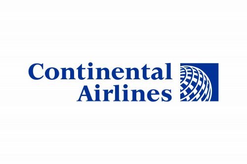
The blue globe emblem was designed by the brand consultancy Lippincott.
This time, the Continental Airlines logo contained many more details. You could see a part of a globe with longitudes and latitudes. The image was placed inside a blue square. To the left, there was the lettering “Continental Airlines” in a serif type with varying lengths of the strokes.
The reason why the company decided to modify the brand identity was the desire to distance itself from the problems of the recent past (the bankruptcies, strikes, poor service). As Hollis Harris, the chairman, explained, the new emblem was supposed to inform the world the company is “new and improved” and is “putting the negative events of the past behind.”
Font and color
The logotype of the former American air carrier’s visual identity is executed in a bold and sleek serif typeface and written in a title case with both of its name’s parts having their first letters capitalized. The typeface of the inscription is very close to such traditional fonts as Goudy National Bold and Mandrel family fonts.
As for the color palette of the Continental Airlines logo, it is executed in a calm and tender shade of blue with white background and accents. The blue and white combination is a symbol of reliability and comfort, along with a reflection of the traditional and fundamental approach of the company, its loyalty, and professionalism. The white color here stands for loyalty and transparency and shows the air carrier’s customers’ comfort as the main value of the company.


