Compaq is the trademark of Compaq Computer Corporation, an American company seated in Houston, Texas, the USA and producing personal computers and computer software. It was founded in February 1982 and was one of the first world manufacturers of IBM compatible computers maintaining good business ties with IBM company. In 1998 the company was the largest PC producer in the world. Nevertheless, in 2002, Compaq Corporation was acquired by Hewlett-Packard and became defunct as an independent company.
Meaning and history
Compaq Computer is a well-known American corporation, which widely supplies portable and desktop computers, as well as servers and networking equipment. The company’s name is a combination of the words COMPAtability and Quality.
The American manufacturer of personal computers was founded in 1982 by Rod Canion, Jim Harris, and Bill Marto, three senior managers from Texas Instruments, a semiconductor company. For a time Compaq was the largest supplier of computers in the world. The company ceased to exist independently in 2002 when it merged with HP.
Compaq’s first investors were the Benjamin Rosen and Sevin Rosen Venture Funds, which helped the young company get 1.5million USD to produce its first computer. In all, the founders managed to raise 25 million USD from venture capitalists.
Unlike many similar startups, Compaq chose not to focus on the price of the product. Instead, they focused on new features, such as portability and improved graphics display.
In November 1982, Compaq announced its first product, the Compaq Portable, a portable personal computer compatible with the IBM PC.
After the merger with Hewlett-Packard in the early 2000s, some Compaq products began to be produced under the HP brand, while others continued to be produced under the Compaq brand, particularly personal computers, PDAs, and servers.
Over time, the word Compaq was removed from the name of the ProLiant server line. Also, the word Compaq disappeared from the name of the line of portable computers EliteBook and ProBook
What is Compaq?
Compaq is the name of an American computer and software development company, which was established in 1982. The company was one of the pioneers in its sphere, and one of the world’s largest PC manufacturers at the end of the 1990s. In 2002 Compaq was acquired by Hewlett-Packard.
1982 — 1993
The first logo was introduced by the company in 1982 and was used until 1993. It was concise and straightforward, having just the brand name “Compaq” written in white block letters over a red and orange line. The company’s trademark on the logo is an acronym and it stands for “Compatibility and quality”. The font was severe and laconic; the letters had square outlines with rounded corners and were slightly tilted to the right. The bowl of the letter “P” and the horizontal stroke of the letter “A” had small gaps. It was a corporate font reminding both of Sonic Std Extra Bold and Inline Square Oblique JNL.
1993 — 2007
In 1993 the logotype was slightly modified. It was still the same brand name but the font was changed. This time, the graphics of the letters became softer and more rounded. The colour of the new version was orange. Starting from 2002 the brand name was used in combination with “HP” emblem of Hewlett-Packard.
2007 — Today
The final version of the Compaq logo was introduced in 2013. It was the concise “COMPAQ” brand name in block letters with graphics of the commercial font Controller Five. The colour was changed to scarlet red. A special feature was given to the letter “Q”. It received a gap in the bowl near the tail, which is now directed downwards, giving the letter the graphics of both “Q” and “C” simultaneously.

Font and Color
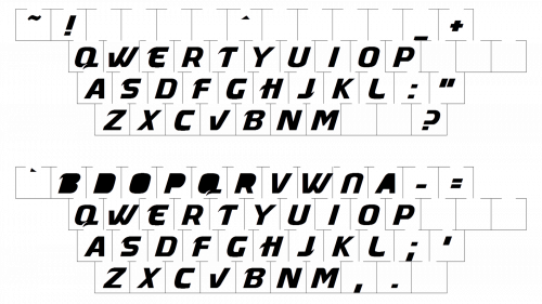
The futuristic lowercase lettering from the primary Compaq logo is set in a custom designer sans-serif font, which reminds of innovations and technologies, and looks very stable and sleek. The closest fonts to the one, used in this insignia, are, probably, Controller Five or Demavand Heavy, but with the contours of the letters slightly extended and modified.
As for the color palette of the Compaq visual identity, it is based on a deep and dark shade of red, which stands for confidence and professionalism, reflecting such qualities as excellence, expertise, and trustworthiness. The unusual red hue makes the badge of the company stand out in the list of its competitors.


