In the fall of 1998, Citigroup was formed as a result of the merger of Citicorp and Travelers Group. In a way, the Citigroup logo is also the result of a merger and reflects the brand identities of both parties.
Meaning and history
In 1812, City Bank of New York was organized. The name Citicorp was adopted in 1967 as an abbreviation of First National City Corporation. By then, the nickname “Citibank” already existed. In fact, it was in use since the 1860s, when it was the bank’s eight-letter wire code address.
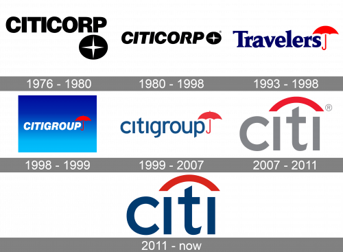
1976 – 1980
In 1975-1998, Citicorp used a logo combining the name of the organization with a star emblem. The star had four points and was placed inside a dark gray circle. The type featured in the word “Citicorp” was updated several times. Originally, two versions were used: one in a bold serif type and the other in a light sans.
From 1976 to 1980, the company used a bold sans serif type where the glyphs stood very close to each other.
1980 – 1998
In 1980, the lettering was italicized. The “legs” of the “R” and “P” grew higher.
1993 – 1998 (Travelers emblem)
The logo of the Travelers financial organization (which was later merged with Citigroup), was more vivid and meaningful. To begin with, it combined two colors, red and blue. Both were rather bright and eye-catching.
The type had a unique touch due to the unusual sharp serifs. The red umbrella bore a symbolic meaning implying that the company is always ready to protect its customers.
1998 – 1999
The original Citigroup logo introduced in 1998 absorbed the color scheme of the Travelers logo and the type of the Citicorp logo. None of them remained unchanged, though.
1999 – 2007
The word “Citigroup” was reduced to “Citi.” A simpler, lighter type without the italics was used. The red umbrella transformed into a red curve. The logo was developed by Paula Scher from Pentagram. Interestingly, she drew the original design on a napkin within 10 minutes.
2007 – 2011
The blue in the word “City” was replaced by gray.
2011 – Today
The company returned to the blue version.
Citigroup symbol


