Cincinnati Bearcats is the name of the athletic club of the University of Cincinnati, which has both men and women teams competing in various sports, such as Basketball, Soccer, Golf, Football, and some more. The athletic team has one of the longest histories in America, with its roots tracing back to the beginning of the 20th century.
Meaning and history
The athletic team of the University of Cincinnati has been known as Bearcats since 1914, when the stadiums were honoring the player of the football team, Leonard K. Baehr, during the match with the club named “Wildcats”. The player was called Baehr-cat, and that stuck. Although the first graphical emblems with the iconic mascot started appearing only at the end of the 1950s, all the previous versions featured classic college lettering, executed in the red and black color palette, the teams’ signifier.
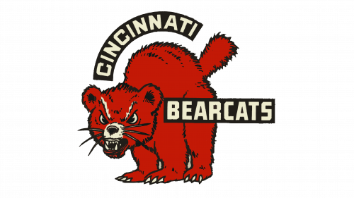
1959 – 1968
The Bearcats logo from 1959 boasted a funny and naive drawing of an animal with an angry grin and a look intent on showing danger, but it was executed in a slightly naive manner, so not much danger was in it, but still, a lot of confidence and brightness, which made the logo recognizable and memorable. The lettering was placed on two separated black ribbons, written in the uppercase white letters of a solid sans-serif typeface. The “Cincinnati” — on the ribbon arched above the mascot’s head, while the “Bearcats” on the horizontal one, overlapping the figure of the animal on its right.
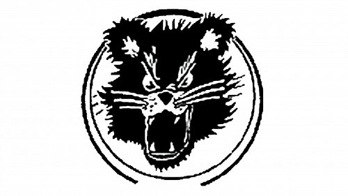
1983 – 1989
The logo from 1983 featured a simpler and more laconic concept, than the previous one. The head of the mascot was drawn in black on a white background and enclosed into a double circular frame, also in black. No lettering, no color accents, no sport-related symbols. The cleaners of the lines were also to be discussed as the drawing itself, was messy and hard to recognize the bearcat. Although despite all the disadvantages, the logo has been in use by the team for good six years.
1990 – 2005
The redesign of 1990 finally introduced a professional and worthy badge, executed in clean lines, with a good idea and a cool light mood. It was a light gray bearcat with a red tongue, which was balanced by the red lettering on top of the logo. The mascot had its paw stretched up and overlapped by the red-underlined letter “C”, the way that the black claws were arched above it, creating the today-famous signifier.
2006 – Today
In 2006 the logo of Cincinnati Bearcats was simplified and minimized. The four mascot’s claws are arched above the bold black letter “C” in an elegant typeface with thin and sharpened ends and a slight inclination to the right. The letter is underlined by a horizontally oriented solid red rectangular, just like the one from the previous version. As for the black claws, they resemble commas, drawn in different sizes upside-down, and this makes the badge truly unique and outstanding.


